Behind The Scenes
Using Stock Splash Photography To Elevate Your Photos
About The Author
Max Bridge is a London-based product photographer who operates under the name Square Mountain. Within his product photography, Max strives to encapsulate characteristics of either the brand or product. This may be done by incorporating any number of things including; fish tanks, powder, liquid, light painting or minimal and elegant lighting. Whatever it may be, Max’s aim is to communicate a message to the viewer.
As a regular writer for SLR Lounge, Max is also passionate about passing on his knowledge to fellow photographers. He firmly believes that, with the right amount of effort, anyone can create work they are proud of, and he feels privileged to help people accomplish this.
If you’d like to connect with Max, you can follow him on Instagram, Pinterest, Facebook and Twitter. You can also find all the articles he has written on SLR Lounge here, and find out more on his website and blog here; be sure to visit the blog and check out his latest articles on product photography.
In this article I’ll be taking you through the creation of this Max Factor Foundation splash photography shot. I will give as much detail as is possible without turning this post into something painfully long. The great thing about this shot is that the splashes used were taken from the Photigy splash pack. Why is that so good? If you’ve ever wanted to include splashes in your photography but have been limited by equipment or facilities, the Splash Pack will solve your problems. I’ll explain more later.
Lighting Set Up For Max Factor Foundation
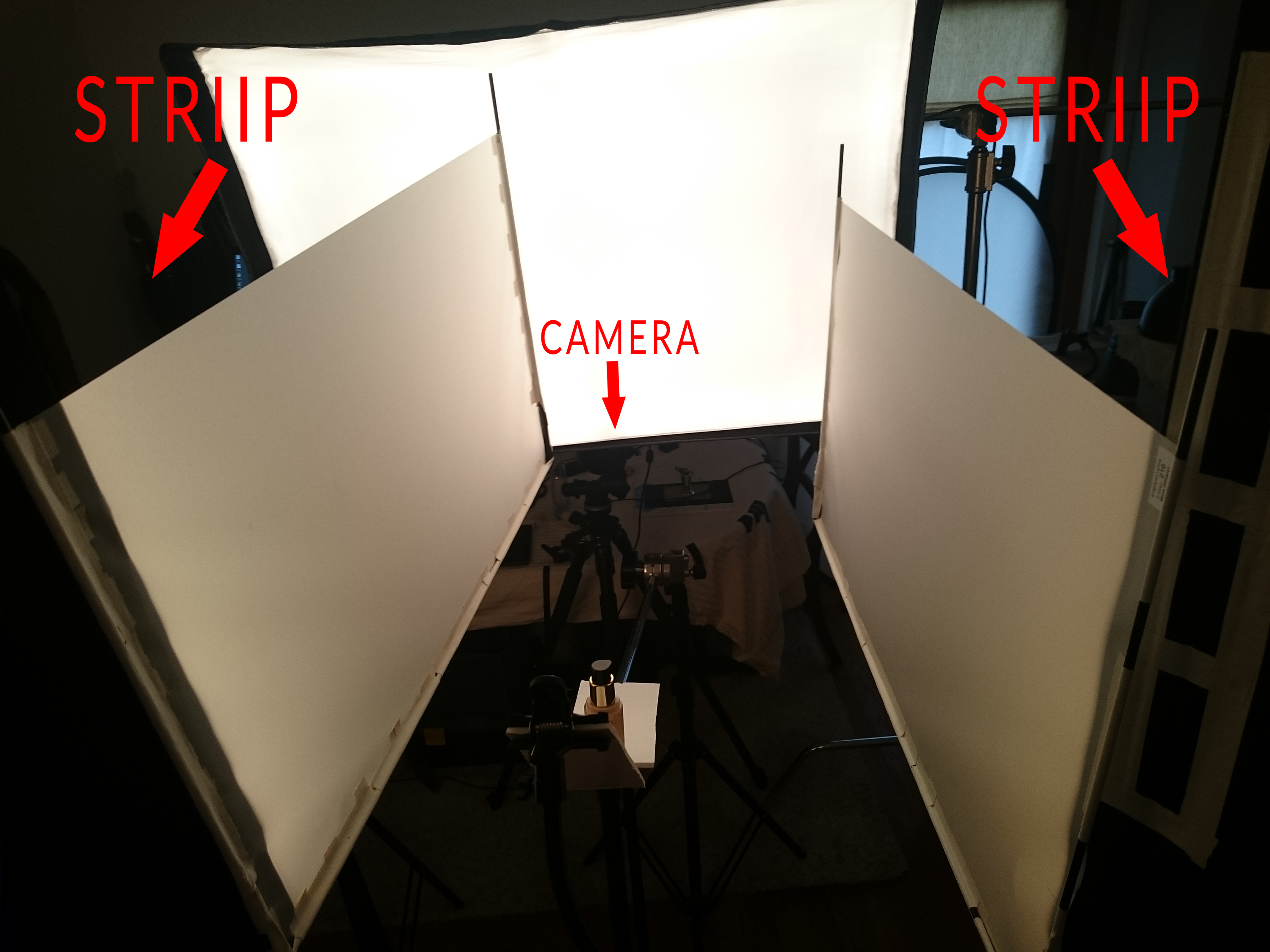
First things first, let’s cover the lighting of the bottle itself. The challenge with lighting any reflective object straight on is that you will get a reflection of your camera. Add a circular shape to your reflective surface and all of a sudden you’ve got something pretty complex to light. The reason it’s so tough has to do with angle of reflection and its shape but I won’t be covering that here, it’s a whole other article.
To get around the issue, I made sure to place my camera slightly below my subject. I then placed a softbox, which you can see above, just above the lens. The reason for that placement was so the camera didn’t have to be too low. Again, a full appreciation of the angle of reflection will help here.
In simple terms, imagine a pool table and the way a ball bounces around. Light travels in a similar way as it bounces off our subject. If this is all sounding very confusing to you then I recommend you check out the course “Starting In Studio Photography”,you’ll find an explanation of the angle of reflection as well as lots of other things.
Back to the lighting. The large softbox you can see, created the prominent highlight on the bottle. By placing two scrims against the softbox I was able to stop the edges of that highlight from being too hard and move it off centre. In addition, using the same scrims, I placed two strip boxes either side and at an angle to the scrims. The effect of this was to create two gradient highlights on the edges of the bottle.
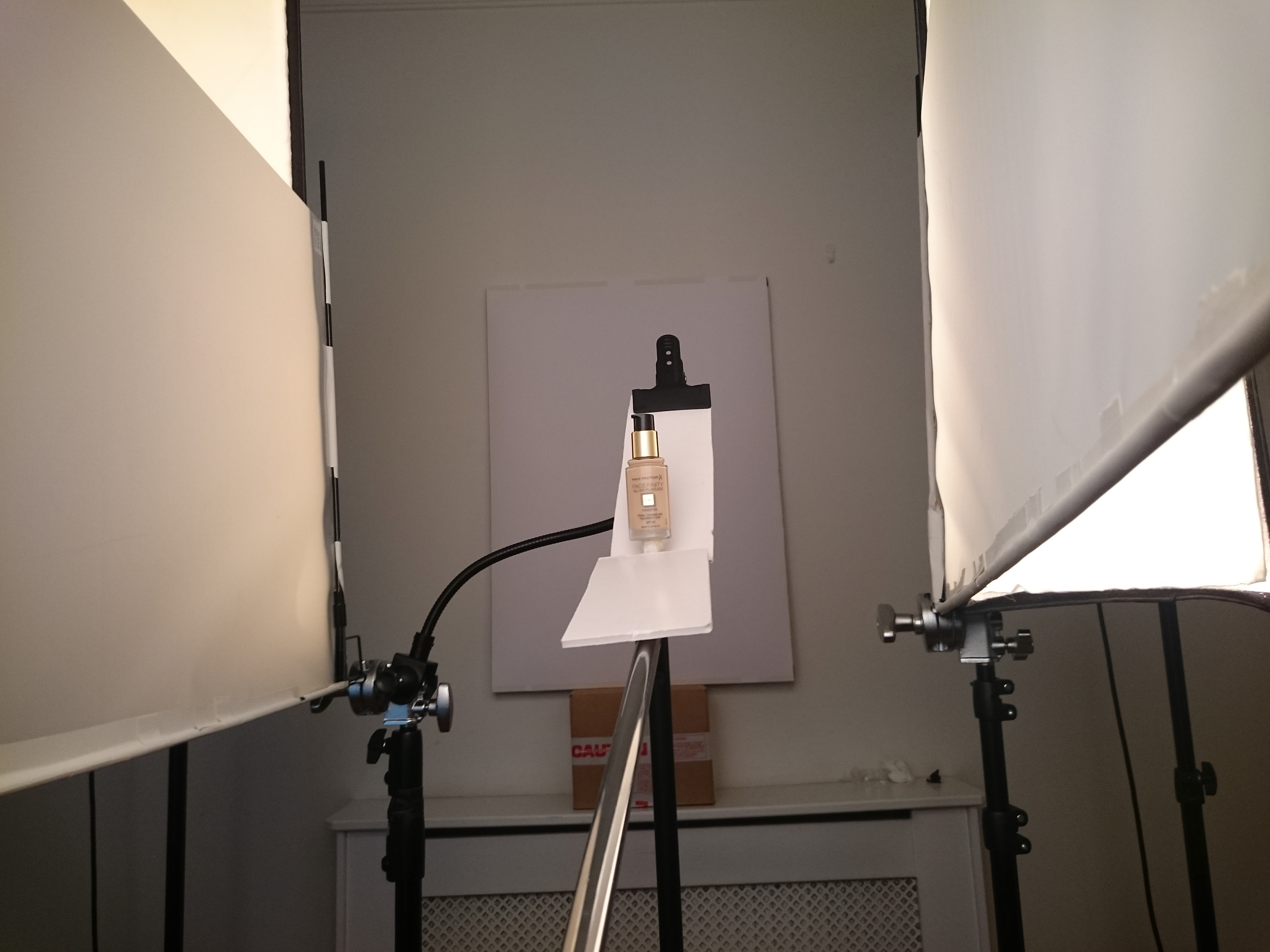
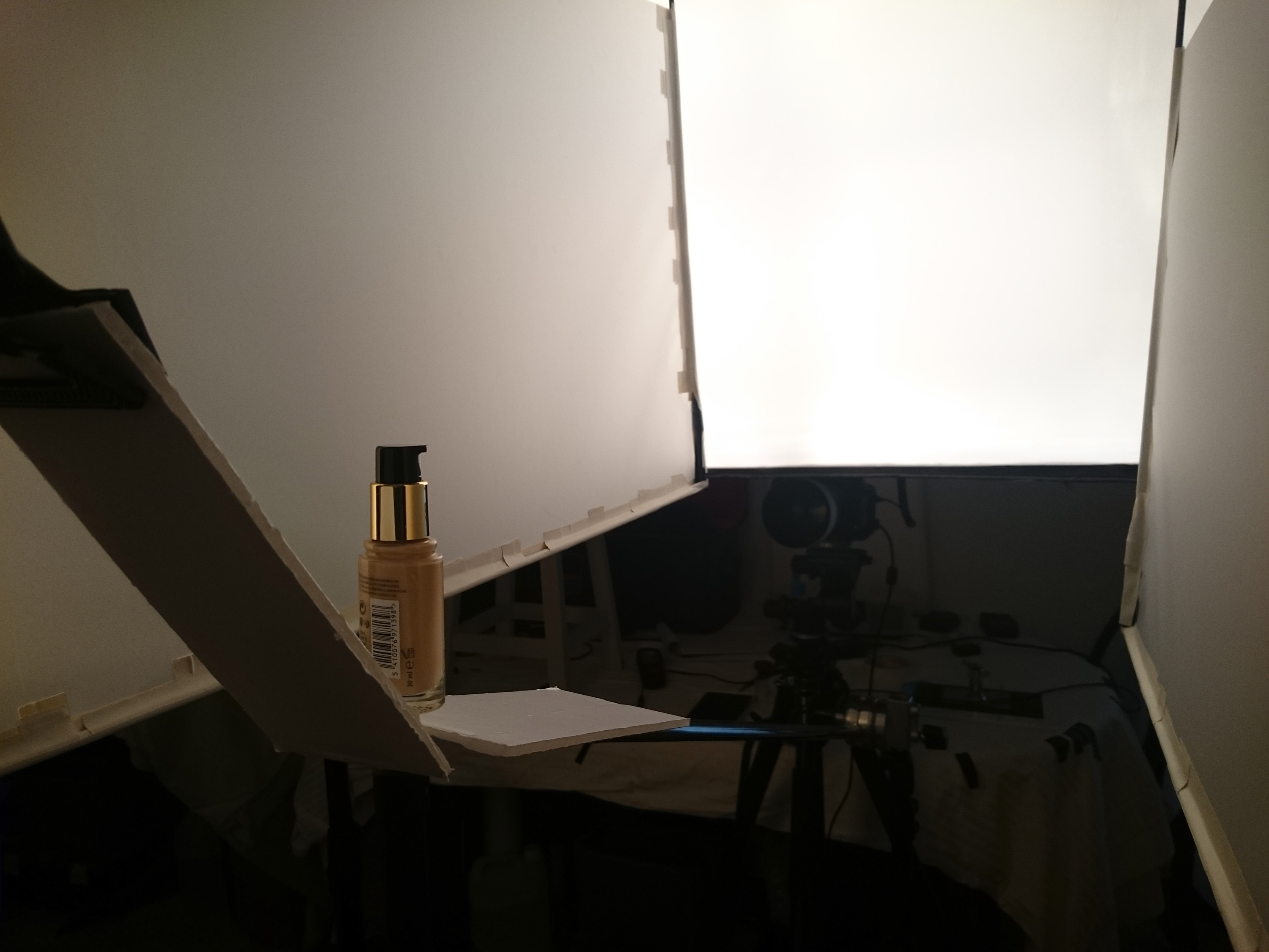
The final BTS shot shows some small pieces of white foam board. The purpose of the one behind the bottle was to stop the glass edges of the bottle from picking up any annoying reflections in the studio. I knew the final image would be on a pure white background, hence this step helped to avoid wasting time in the edit. The second piece of white foam board provided a small amount of bounce to the bottom of the bottle, which I felt was a little dull.
That’s it for the lighting. It was pretty simple but the key things to takeaway are; an understanding of the “angle of reflection” was a big help, shooting with the edit in mind saves time, and be mindful of gradients (the stripboxes) and hard edges (the large softbox) on glossy subjects. That last point is important. If all you have is smooth gradients, your subject, no matter what material it is, will look matte.
For more info on these topics, take a look at the latest episode of Friday Photo Talk in which Alex photographs a cylindrical glossy object. If you’re ready to dig your teeth into something more substantial, then I’d recommend the course “Studio Product Photography Essentials“.
Editing Max Factor Bottle In Photoshop
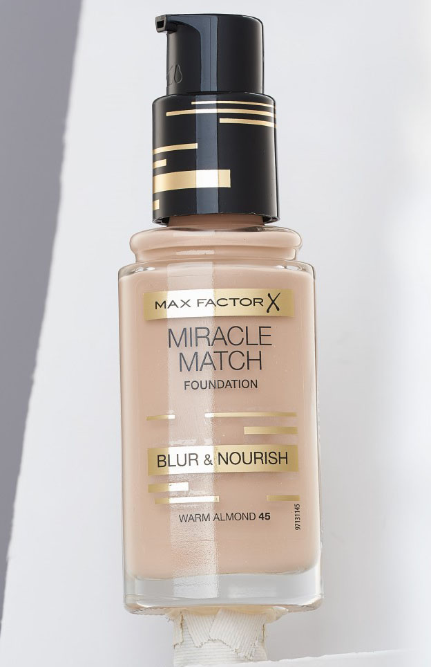
Two things you may immediately notice about the SOOC shot above are that the labels are all blown out, and the bottle top seems very high. Due to the difference in material between the labels and the bottle / liquid it was necessary for me to shoot a second, darker image to retain the detail in the label. The first step therefore, after going through Helicon focus, was to composite the two images together. I had also unscrewed the bottle top to angle it in a pleasing way, and hence it needed lowering. Both tasks were easy to accomplish with the creation of a few masks using the pen tool. The result can be seen below.
An important point may have slipped past you there. Helicon focus is a vital program for product photography. I shot this image at f11 which would usually be enough to get complete sharpness, top to bottom. However, as my camera angle was quite low I found certain areas were soft. Having your entire product sharp, unless otherwise requested, is an essential part of product photography. Therefore, the use of focus stacking software is necessary. I use Helicon focus, which you can purchase, with a little discount, here.

If You Think You’ve Spent Enough Time Cleaning, You Probably Haven’t
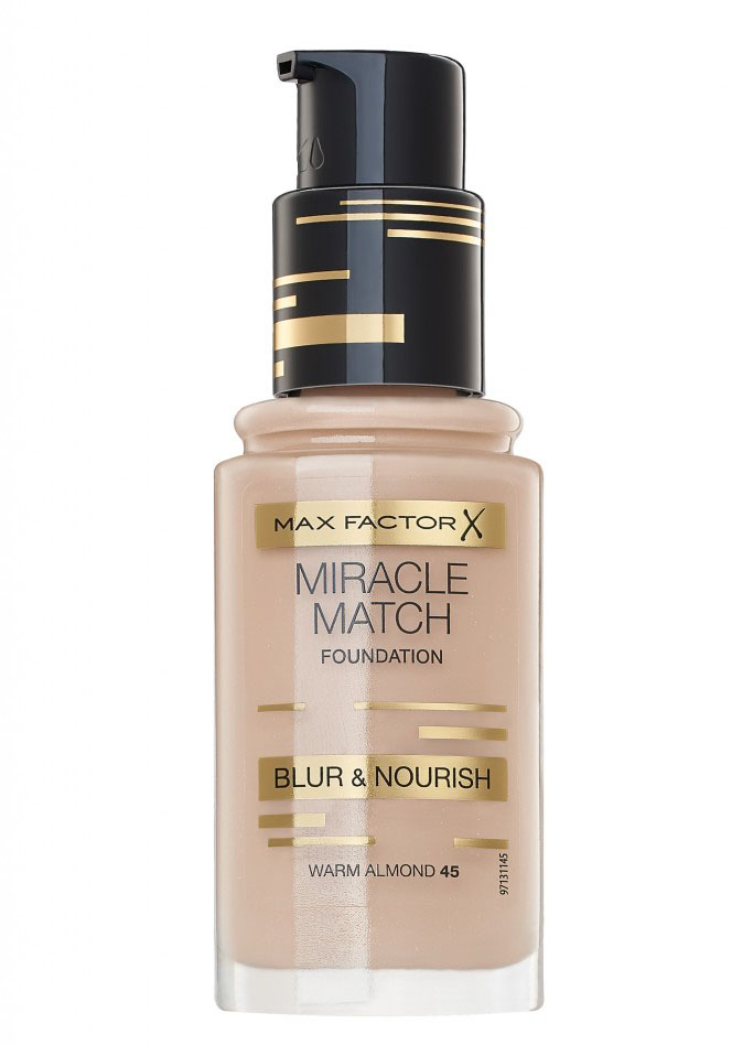
This stage of any product shot is probably the most time consuming. I always clean an item as much as is possible on set, giving it a few quick sprays to remove dust prior to shooting, but no item is perfect. There will always be little imperfections in every material. That may be strands of fabric on a shoe, bumps in leather, issues to the label, frayed edges, scuffed edges, and so on.
In the image above, you can see the Max Factor bottle having been thoroughly cleaned. Sadly, I cannot take you through every method I use for cleaning, that would be a book. What I will say, however, are the theories I use while editing. Firstly, the item should retain its detail; blurred does not equal clean. Secondly, you need to stay true to the actual product; go too far and all of a sudden your image is not representative. Finally, keep an eye on the little things; straight edges should be straight, labels should be aligned correctly, and so on. It’s a laborious process but if you don’t spend the time here, your photos WILL look amateurish.
For some of the best courses on product photography post production, I’d recommend “Advertising Product Photography part 2, Post-Production“ which is a course that accompanies a Pro Club membership.
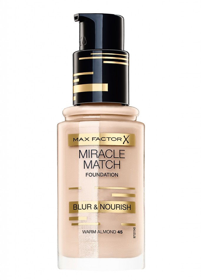
The final stage of the edit (in my workflow) involves creative adjustments to contrast and colour. I use a combination of precise masks coupled with Curves to selectively adjust the contrast. In this example I had masks for the top, bottom, and labels. I also did some free hand dodging and burning to certain areas. The aim here is to draw the viewers’ attention to the brand and to accentuate the properties of the various surfaces.
Time To Add Some Splash Photography
Up until this point, while it takes some time to attain this level of attention to detail, anyone could perform the same tasks and get similar results. The trouble with splash photography is you often need a lot of space and some fairly expensive kit, making it prohibitive to many. In the next few steps, I’ll explain how I took a few stock splashes from the Photigy Splash Pack and transformed them into the final photo.
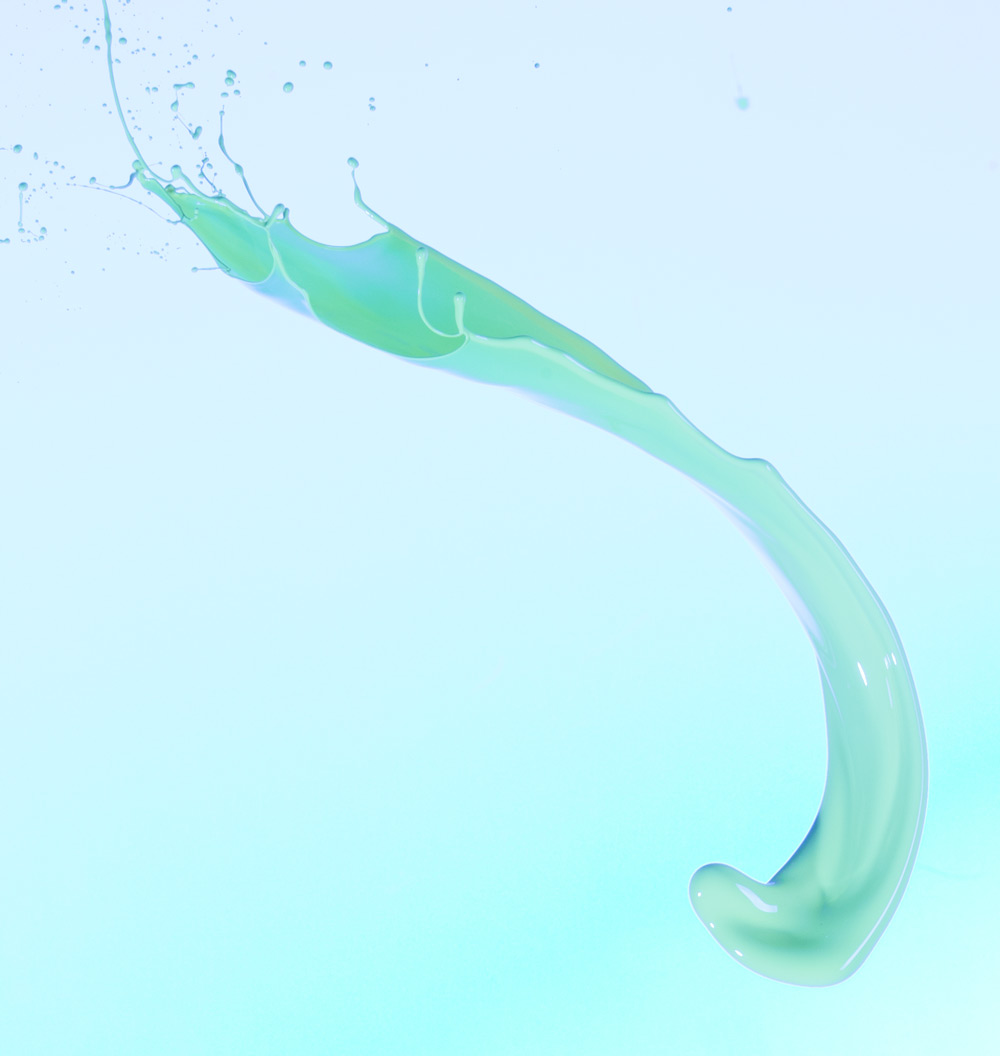
The photo you can see above is the RAW splash, you’ll find hundreds of these inside the splash pack. Having opened the splash in ACR I perform some simple adjustments; highlight / shadow recovery, basic sharpening, clarity etc. The aim is to edit the image until the contrast and brightness is on a similar level to what I will eventually desire and try to mitigate any blown out or clipped areas. Having done so, I duplicate the layer (Rasterize it, if opened as a smart object) and open the layer in the Camera Raw Filter. What we are now doing is editing this shot to increase the difference between the splash and the background. I used a combination of vibrance and saturation to accomplish this. This step may seem odd but all we are doing is giving Photoshop better data, if you like, for our next step.
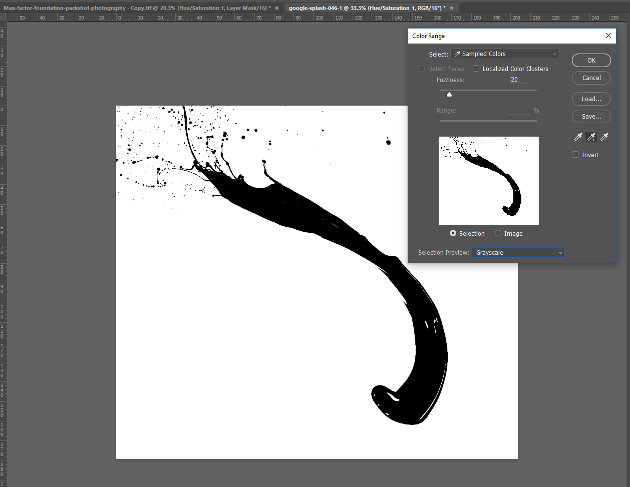
Using the layer you have just edited, head to Select > Color Range. From here, use the “+” eyedropper to select as much of the background as you can. You’ll need to mess around with the fuzziness slider to get a good result.
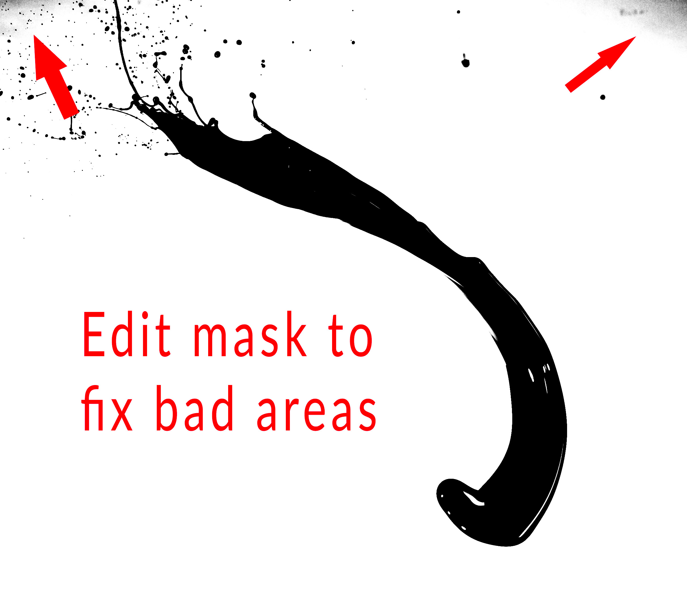
As you can see, the mask which is created is fairly accurate although it could benefit from a little manual editing. Alt + Click on the mask to make editing it easier.
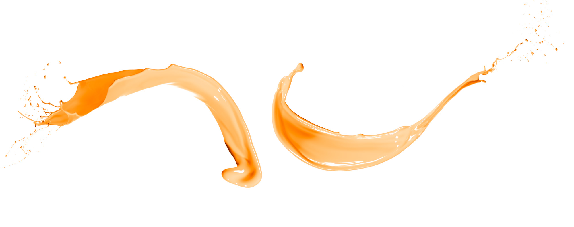
Having cut out the splashes from their backgrounds you are now free to manipulate them as you wish. I used a combination of tools to adjust their size and shape, things like Puppet Warp and Liquify. In this instance I also opted to edit the splashes themselves to make them appear closer in composition to what I would imagine the liquid inside the bottle to be. I did this by smoothing the transition between tones using Frequency separation and, as you should have expected, by cleaning them.
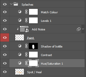
The final stage of the splash photography was compositing it with the Max Factor bottle. The hardest part here was colour matching them. I got them in the rough ballpark by using a hue and saturation layer and then more precisely matched the colour using the colour sampler tool and Curves. After that, it was a case of adding shadows to make them appear closer to the bottle. I often find that shadows are peoples weak points, they’re mine too. Always try and think about shadows. The correct use can make or break a composite.
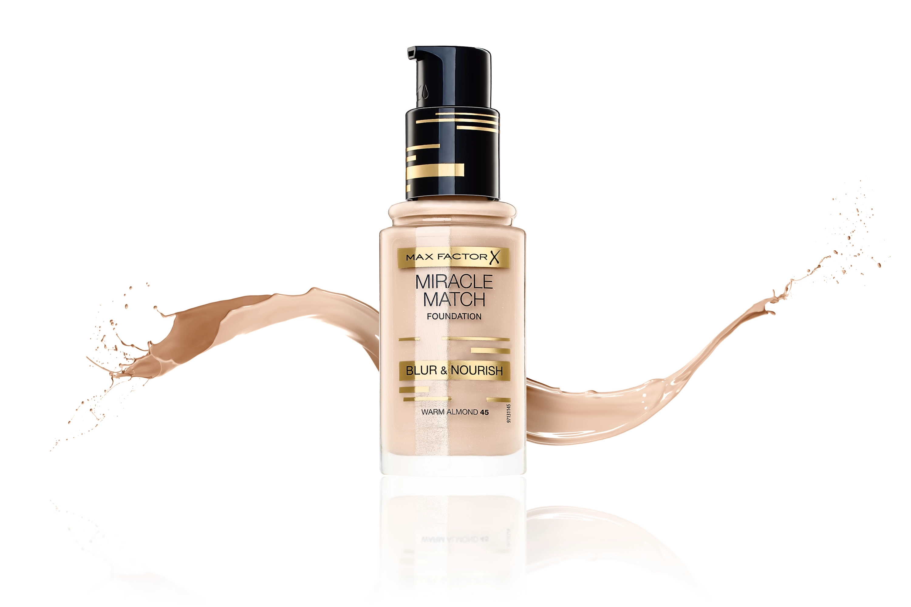
You can see the final result of all this work below

Summary
The Photigy Splash Pack is fantastic. It allows photographers to incorporate elements in their photography which otherwise they would not be able to. However, caution is necessary. If you’re creating photos for your own personal amusement then fine, go crazy. On the other hand, if you intend to place these photos in your portfolio bear in mind that you should also have the knowledge and skills to create the splash photography yourself. Granted, the splash pack is Royalty free but there will come a time when a client asks for something and you find yourself in a position where you need to create some splashes yourself. Personally, I’d prefer to also have that knowledge.
As such, I advise anyone looking to use this splash photography pack to also take a look at the Advanced Splash Photography Course. The comprehensive course will guide you every step of the way from gear to post production. That way you will always be prepared no matter what your clients request.
You can find the splash photography course here, purchase the Solid Splash Pack here, and find the Transparent Splash Pack here.
Connect with Max
