Behind The Scene of High-End Commercial Beverage Photoshoot:
Part Two, Post-Production
 Mark Zawila is a digital artist, retoucher and photographer, specialising in high-end food, drink and product imagery for advertising. Mark’s images have been used commercially for print and web both in the UK and internationally and he is proud to have worked for clients such as Harrods, Sky, Lego, Sony and Miller. Mark is also passionate about working with small businesses and start-ups offering, exceptional imagery at a cost that won’t blow the budget.
Mark’s fully equipped studio space is ideally located between Basingstoke and Reading just off the M3, and less than one hour from Central London. Mark helps businesses by creating exciting and engaging images that blend design principles and creative ideas with technical expertise. He specialises in packshot photography, creative still life photography, food and drink photography and high-end retouching. Mark not only produces high quality imagery, he can also advise clients on concepts and visual strategies to communicate their brand more effectively.
Part One of BTS describes pre-production and production and in Part Two I will share some of my post-production techniques and workflow.
Commercial Beverage Photoshoot: Part Two, Post-Production
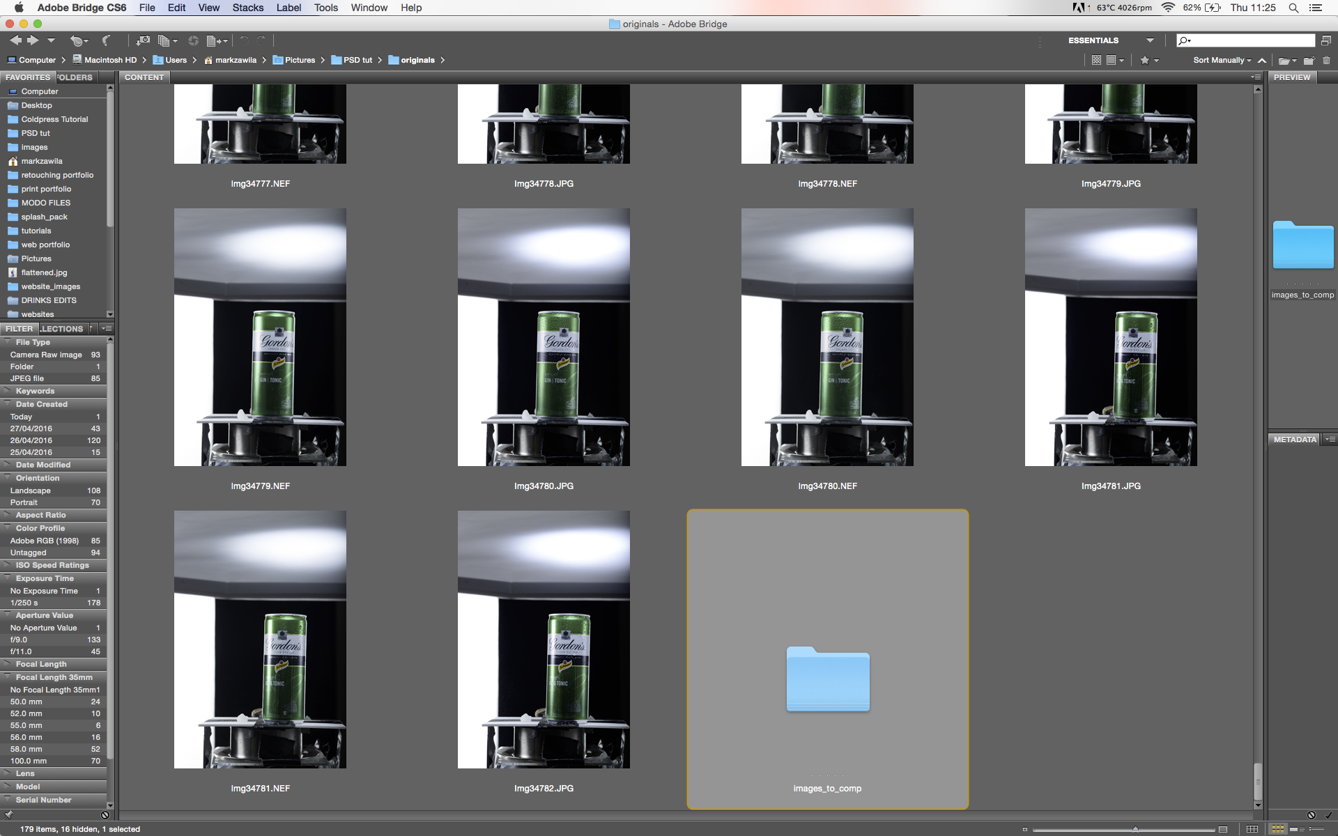
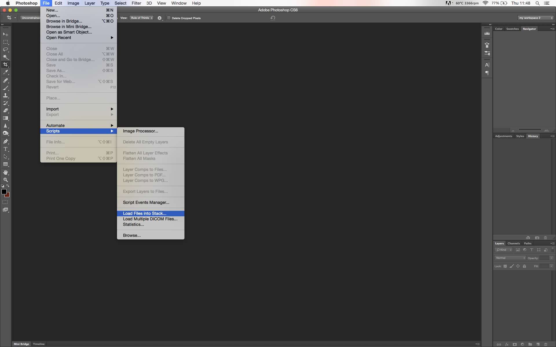
Step 1. I start by creating a new sub-folder in my main images folder in Bridge, in this instance I have named it ‘images_to_comp’, but you can obviously name it whatever you like. I drag all the RAW images from the shoot (that I want to use for the composite) into this folder.
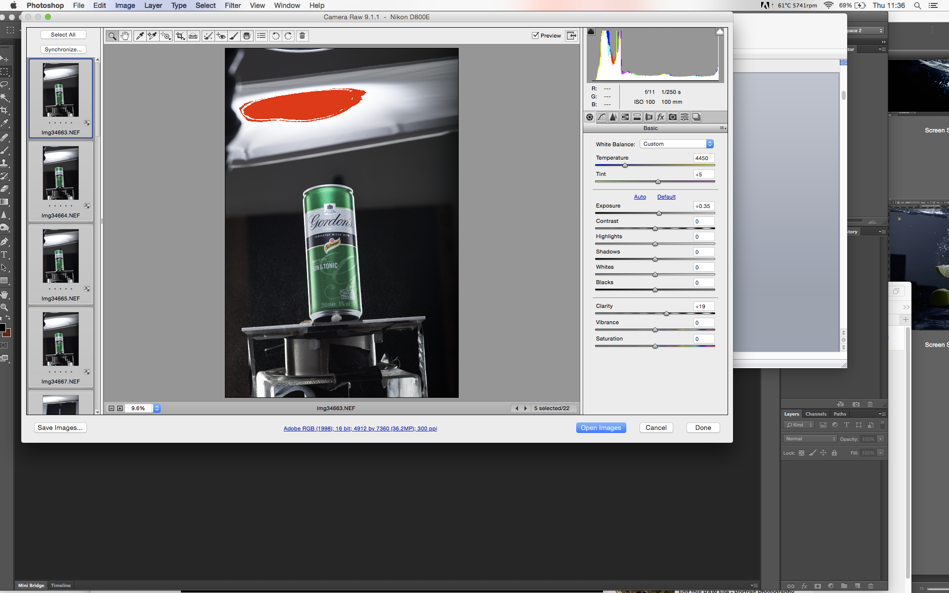
Once I am happy with all my changes, I can then save the settings as a preset to apply to any images I might want to use later – to do this, go to the tab in the editing section, open up the menu and select Save Settings. The settings can then re-opened using “Load Settings…”. Once I am satisfied with the settings I click ‘Done’.
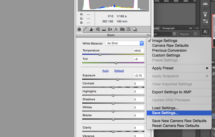
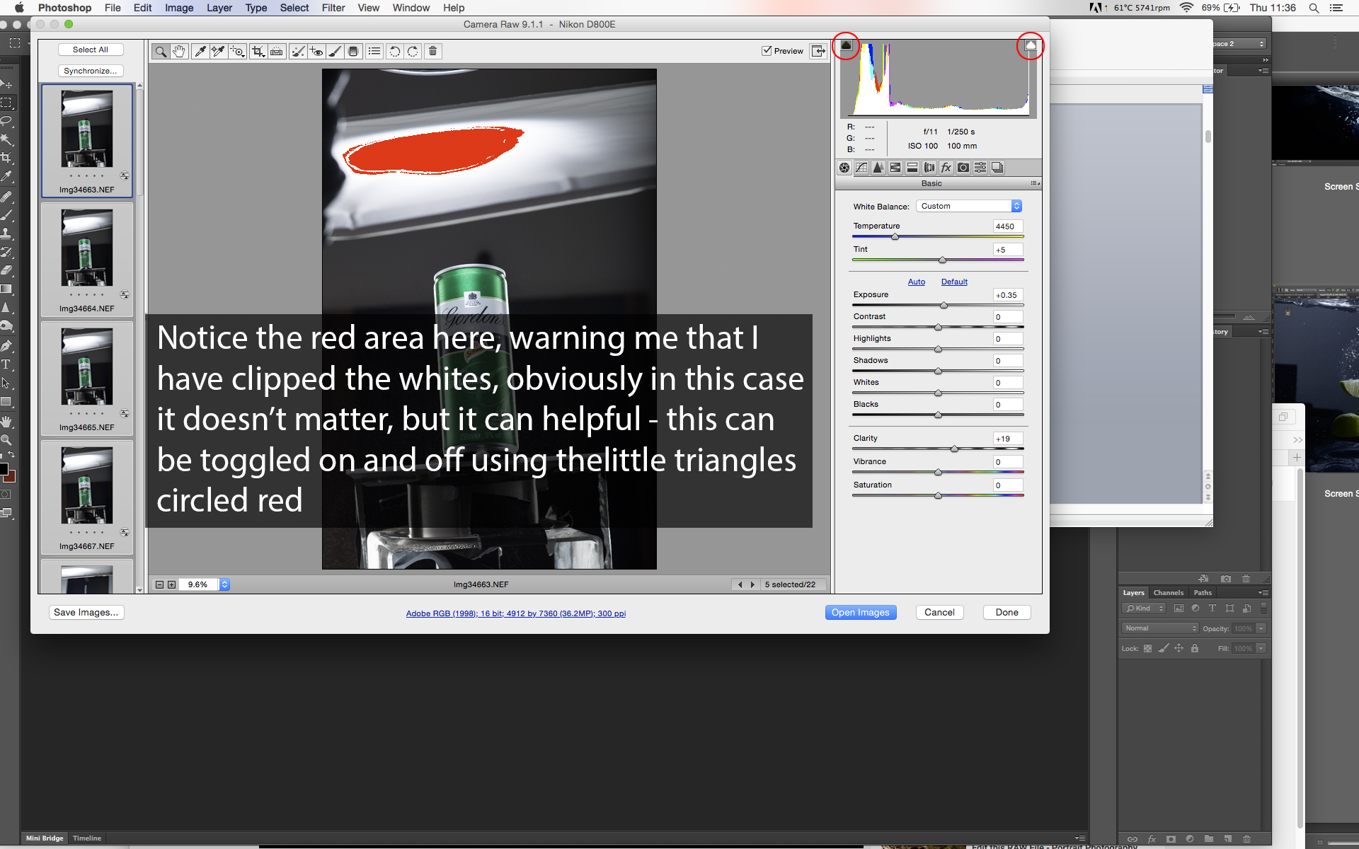
Note: The red patch at the top of the image is warning me that I have blown out highlights in this area. This is because I have ‘clipping warning’ turned on, which can be toggled on and off by clicking on the white and black triangles either side of the histogram (see below), this warns me if I have blown out highlights or clipped blacks.
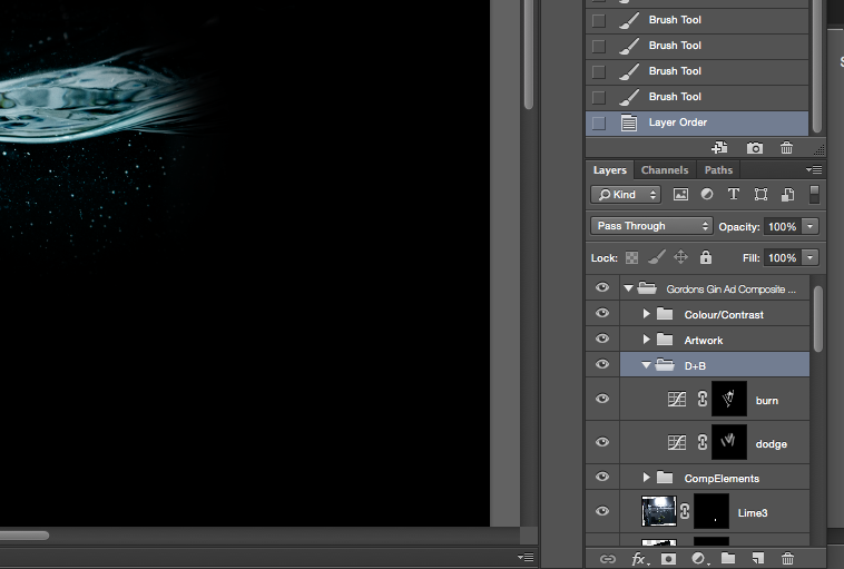
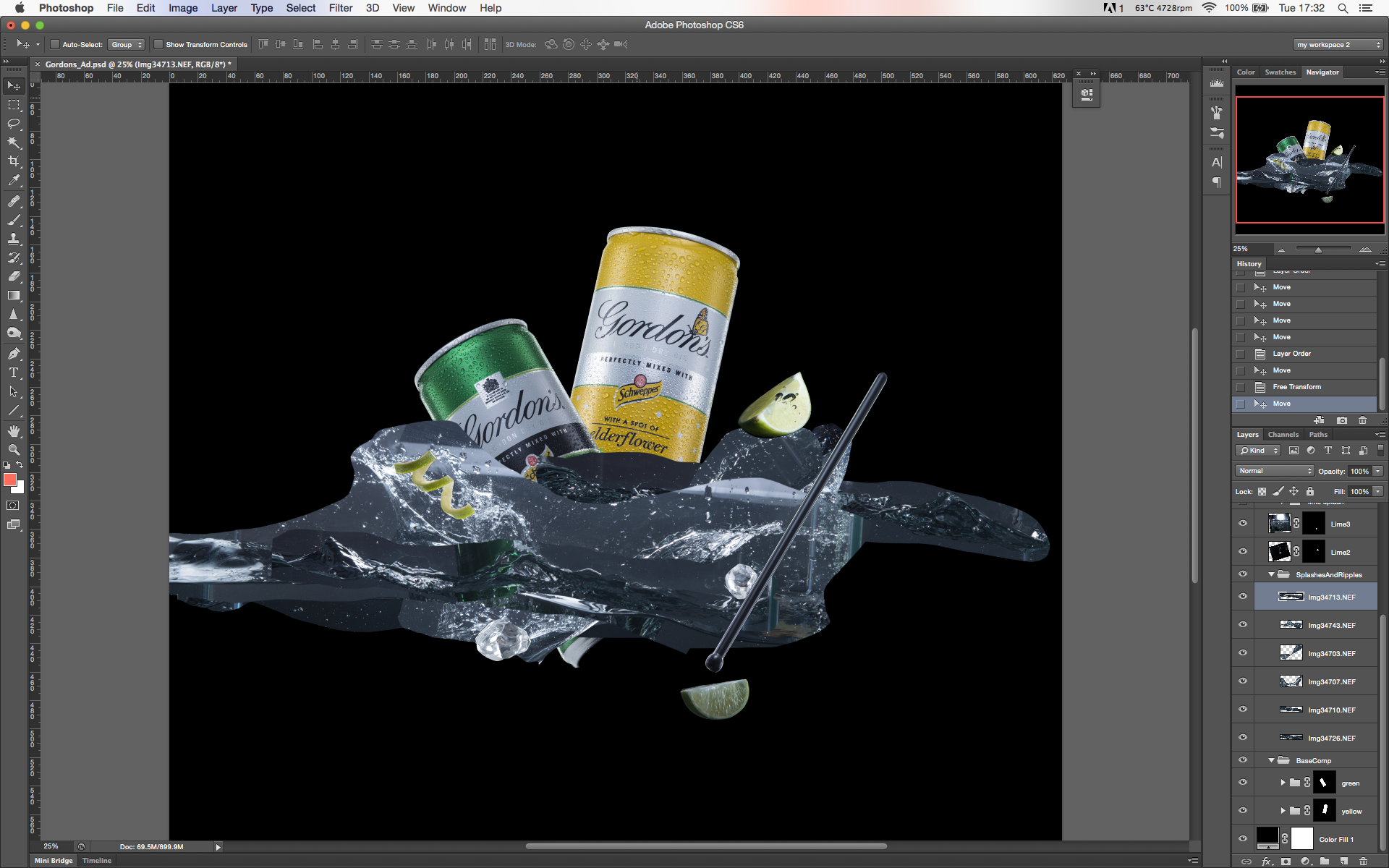
Step 4. Next comes a really important part of the process, your file-organsiation. This will not only save time while your editing but if you need to come back to a file to make changes at a later date, you will be very glad to have a logical, easy to understand file structure. Below is an example of my basic file structure, I wil add more folder and layers later but this is the foundation I start all my product retouches.
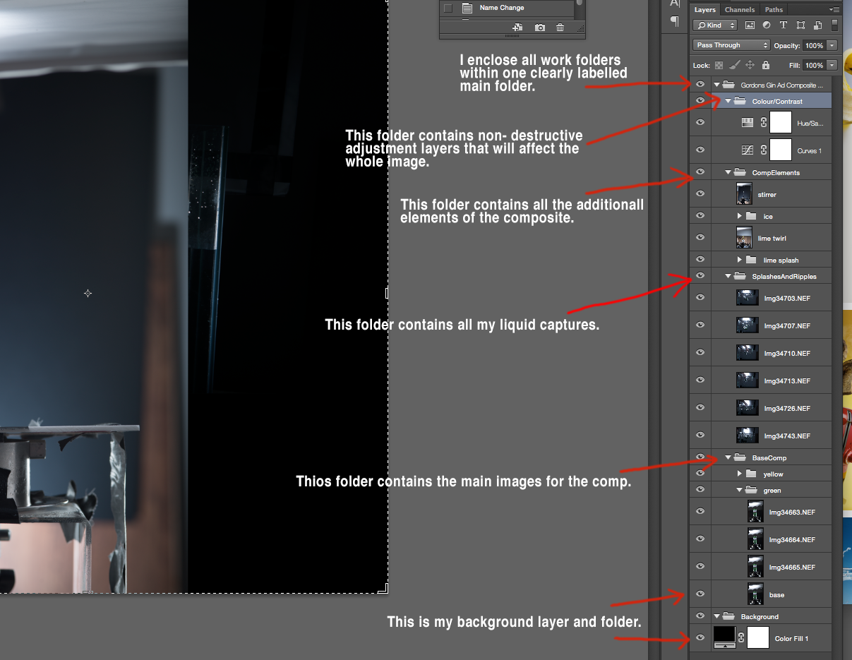
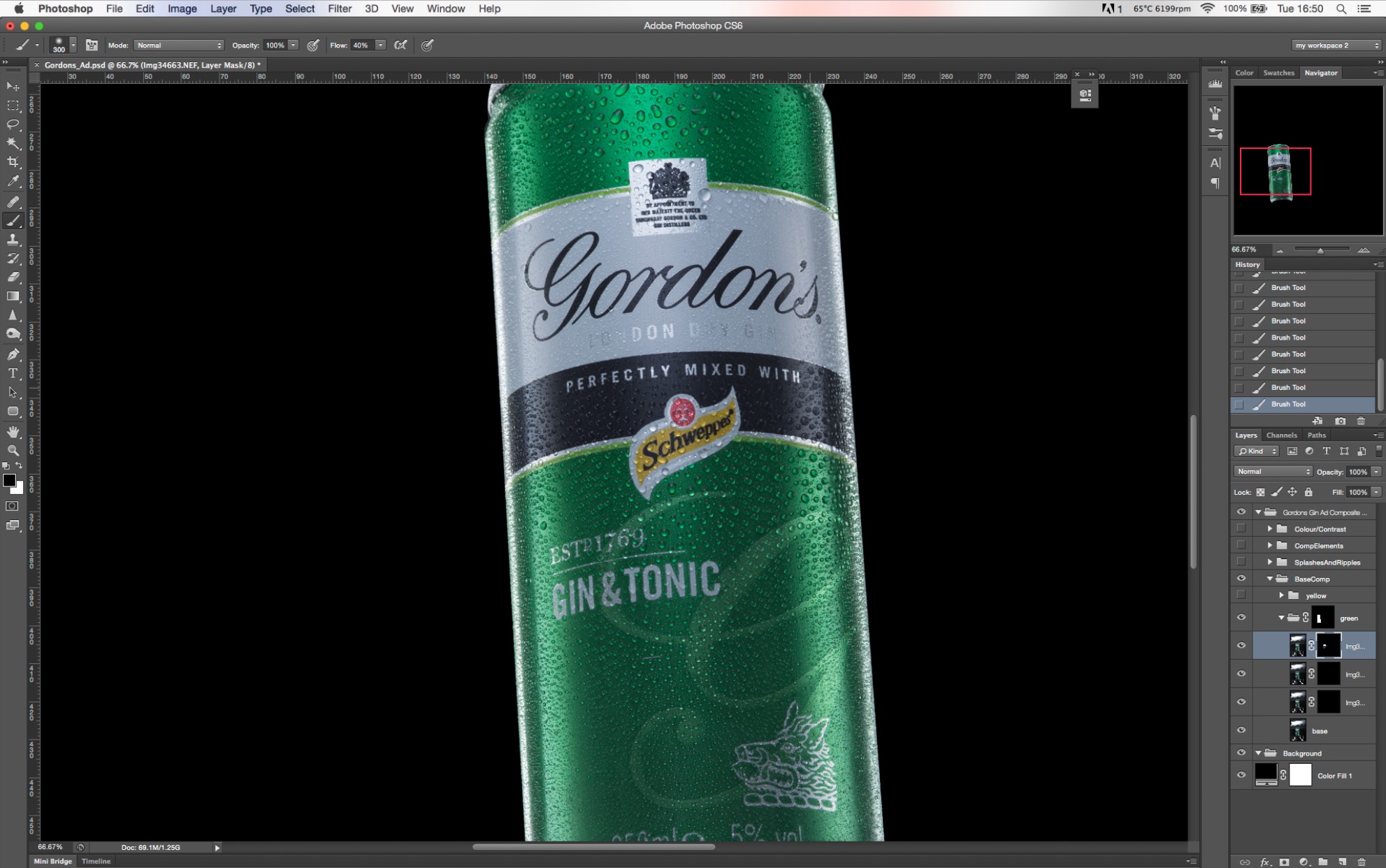
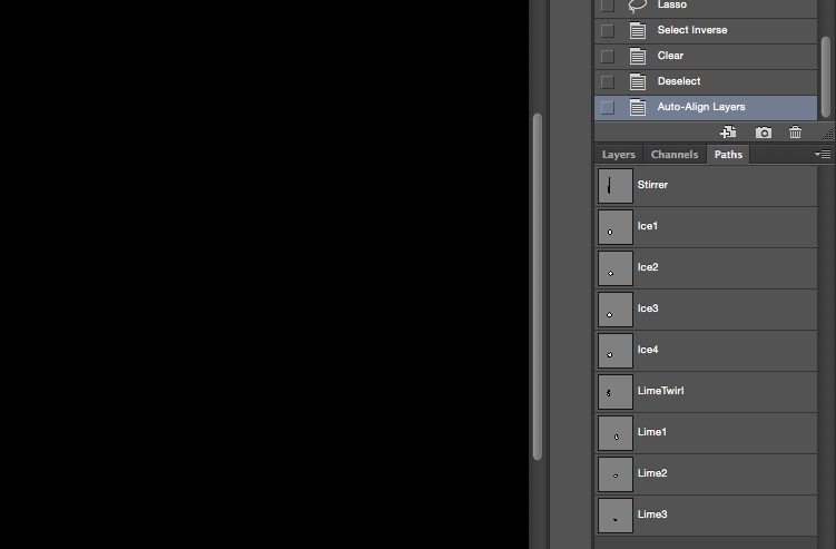
Step 5. Now I need to mask out all the elements , so using the pen tool, I create paths for all the component elements, except the liquid and the drinks cans, which I will come to later. I then mask all relevant layers and folders.
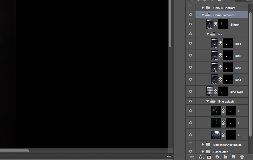
Step 6. Next I come to the ‘base’ elements of the composite, the drinks-cans. I have used multiple images of the ‘cans’ with different amount of spritz, this is so I can control the overall look of the drinks-can by masking out areas that I don’t want to see the droplets i.e. any branding or tect. If I was to try and get the droplets exactly how I want them in-camera it would be very time consuming so this way I have complete control and I can play around until I have the exact ‘look’ I want.
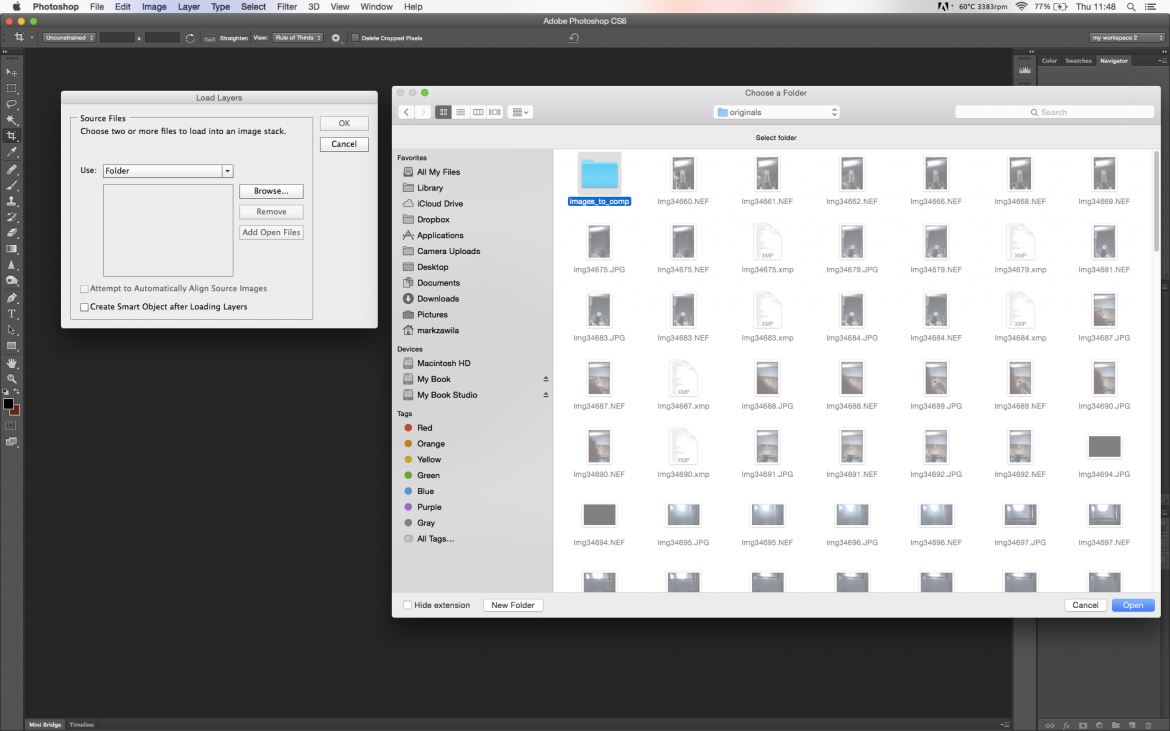
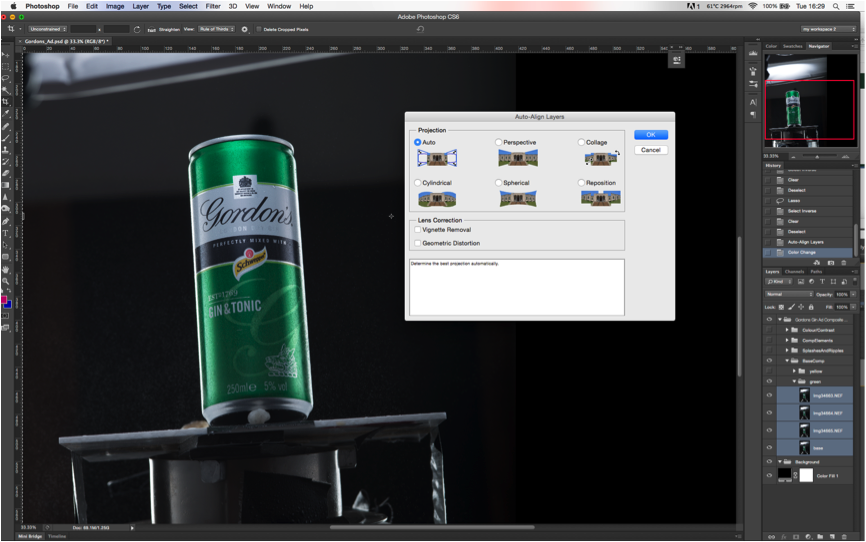
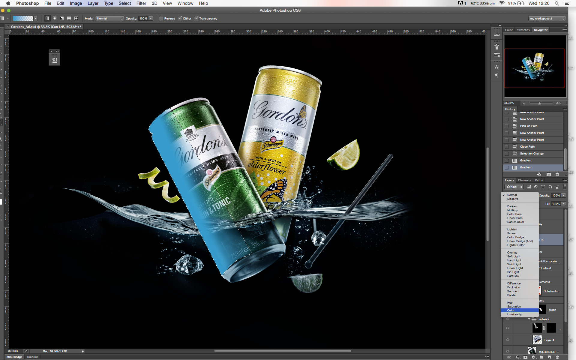
So, the first thing I need to do is make sure the images are perfectly aligned. In order to make sure the images line up perfectly. For this I use ‘Auto-Align Layers…’.
Start by selecting all the images you want to align (Note: If only one image is selected, the Auto-align tab will be ‘greyed out’,) then go to Edit>Auto-Align Layers… Choose ‘Auto’ and all the images should now be aligned.
Step 7. I now mask all the aligned images in the group except one, I name this layer ‘base’. I created a path around the can and masked out the folder, so any edits I make within this folder will be affected by the mask.
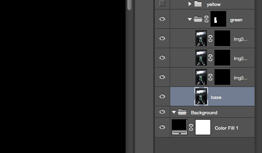
Step 8. Using a white brush I paint around the label so the larger droplets arent over the branding which I want to remain clean and easy to read.
I then repeat this with the second drinks can.
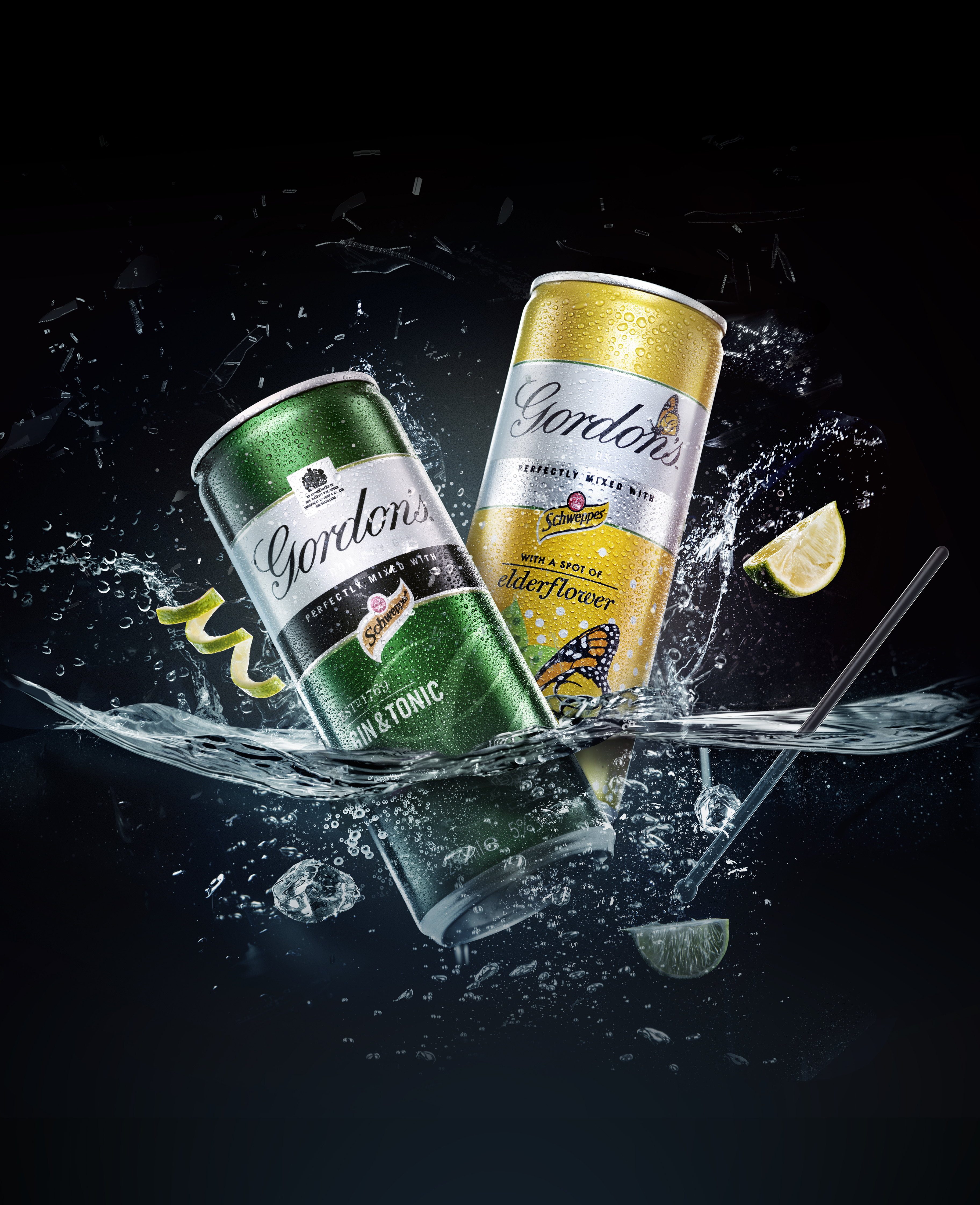
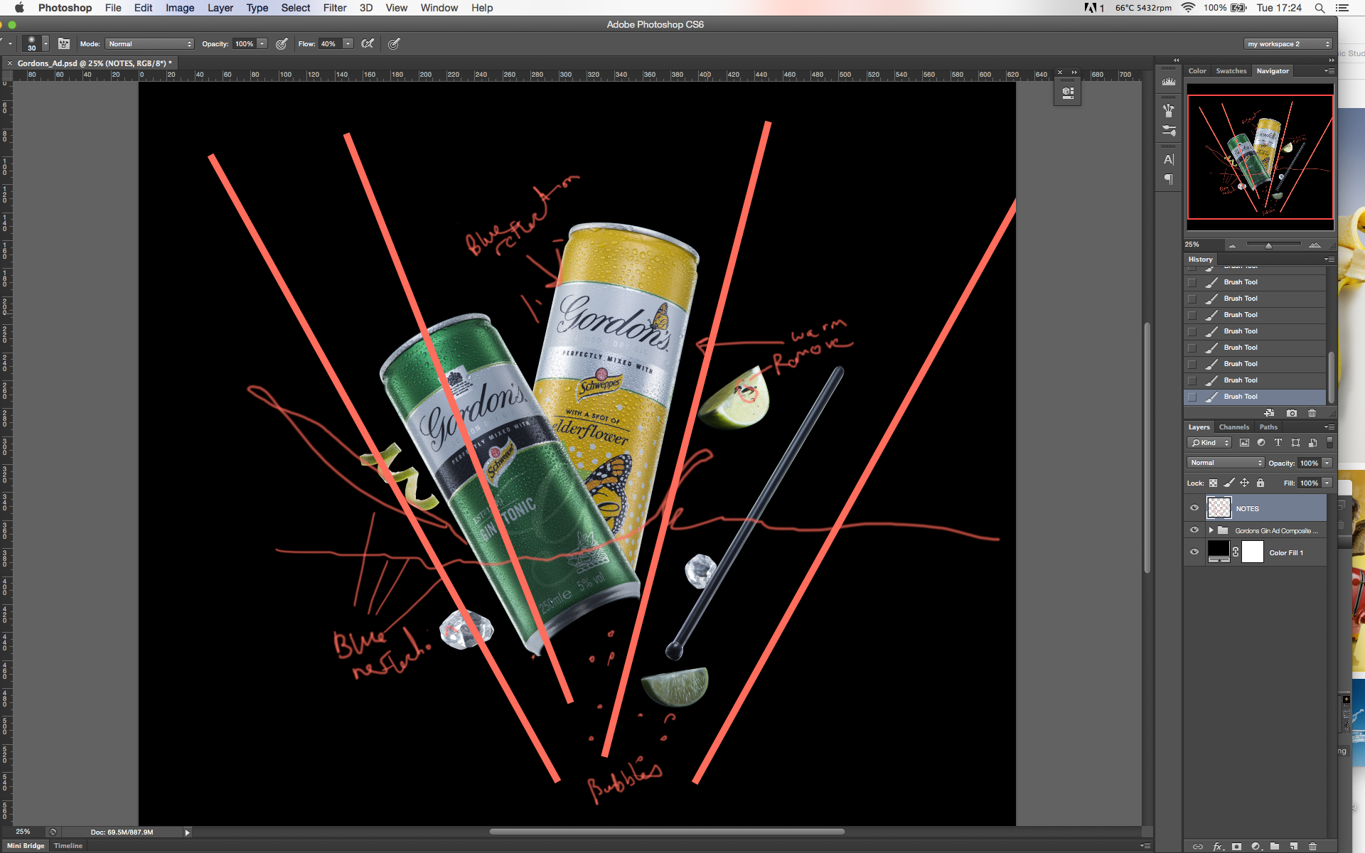
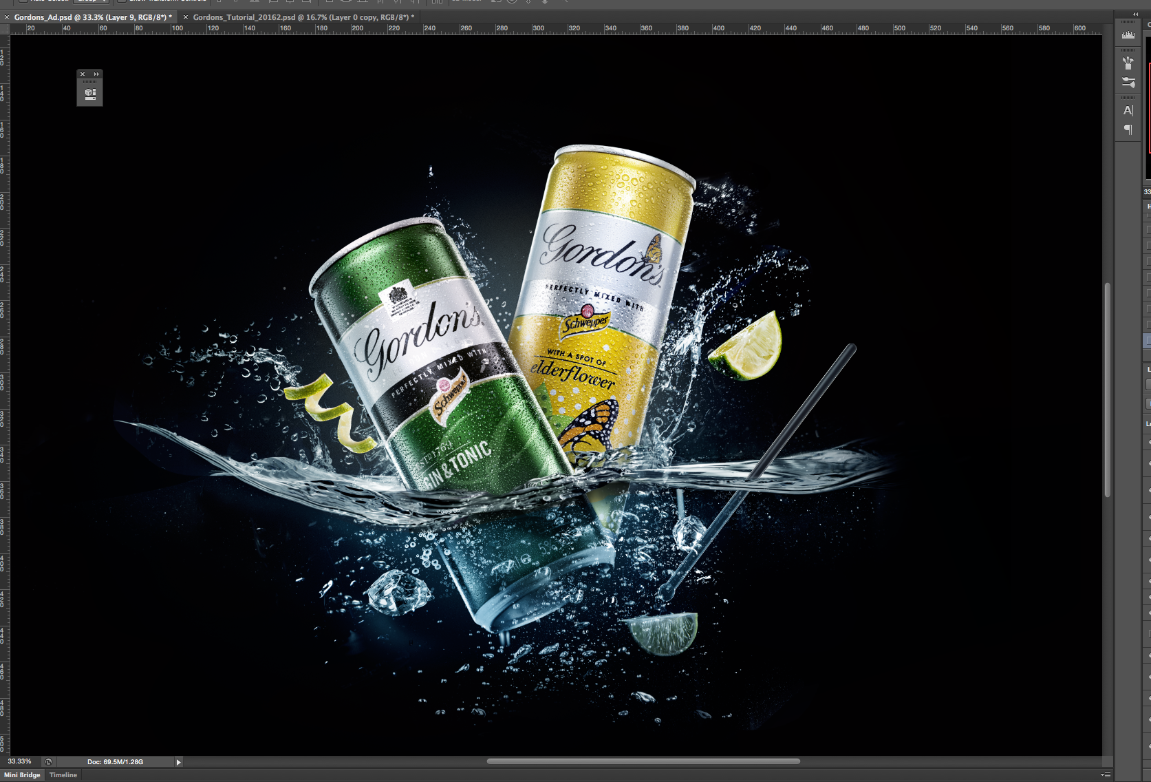
Step 9. Next I put the all elements together based around the initial sketch from Part 1
I created a blank layer where I made notes also the red lines help with the composition, I can toggle this on and off to use as a guide.
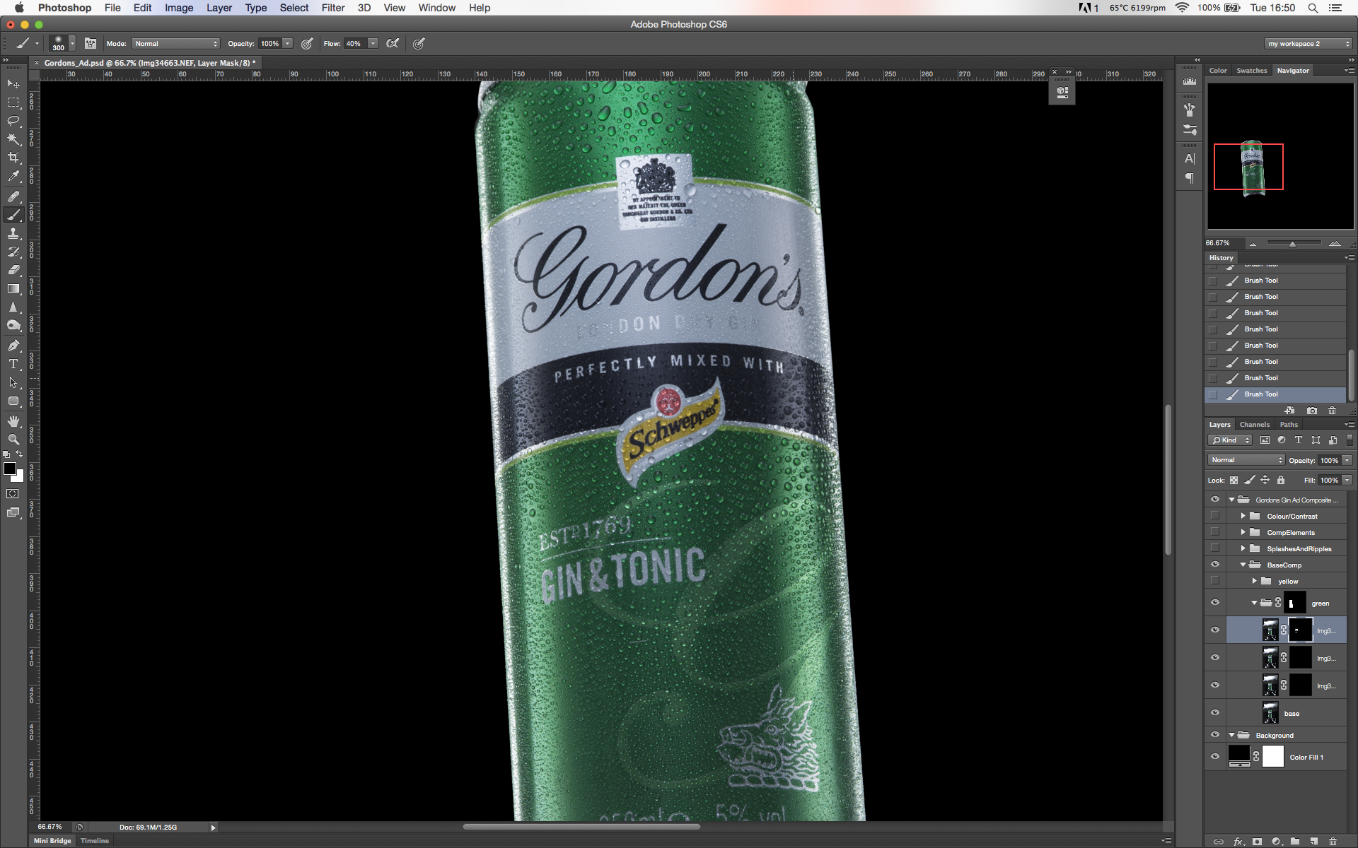
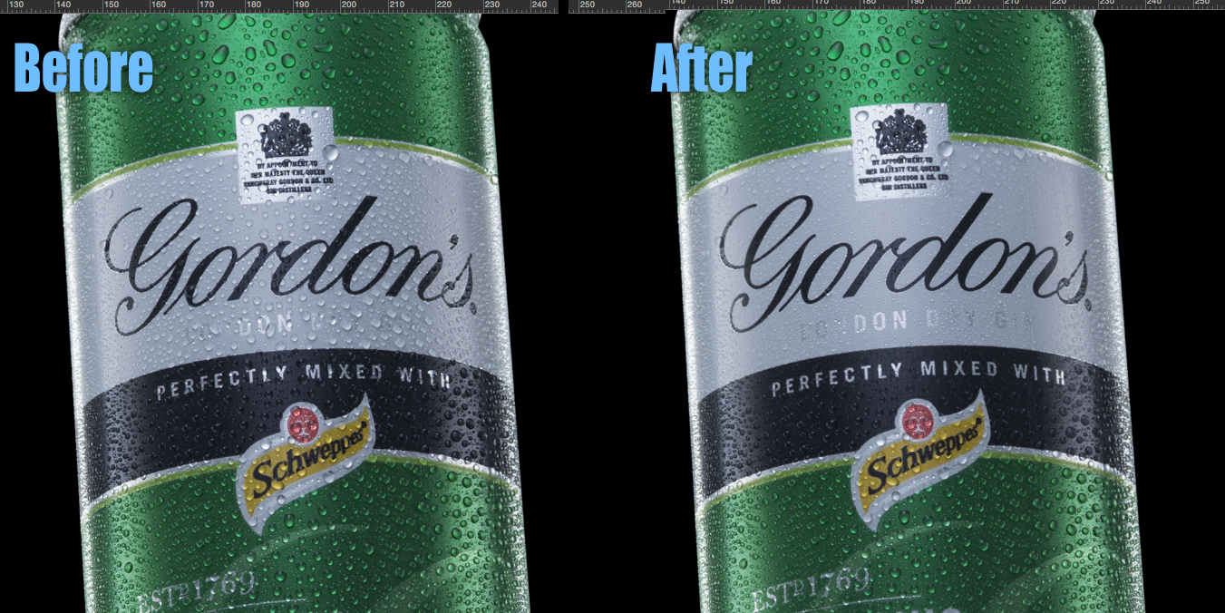
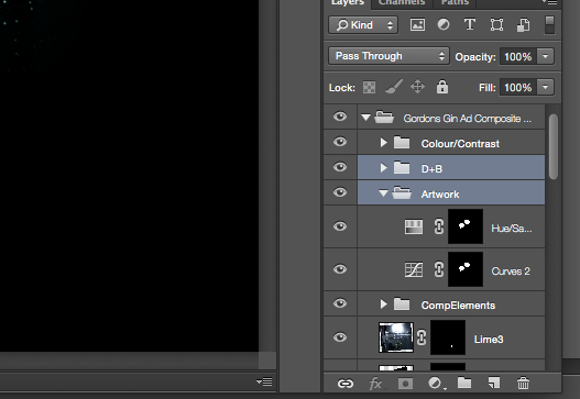
Step 10. Now to retouch the drinks cans and components. Firstly I use the clone stamp and healing brush to remove any unwanted elements. Then I use the ‘dual curve layers’ method of dodging and burning to bring out the shape of the subjects and to add a bit more contrast.
For this I create a new folder just below ‘Colour/Contrast’, near the top of our folder hierarchy (this will affect all layers below but not above). Then I create two curves adjustment layers, one to darken (burn) and one to lighten (dodge) and then invert the masks so they are black, and use a white brush to reveal the areas I want to lighten or darken. This video explains this method in more detail
Step 11. Next I want to work a bit on the artwork and the labels. So I make a selection of both labels after creating a path with the pen tool, I then create a new folder called ‘Artwork’ . I begin by creating two new adjustment layers one for hue and saturation and one for contrast (curves). Note if you have a live selection a layer a mask is automatically created when you load a new adjustment layer based ion the selection. I also lowered the saturation slightly.
I then wanted to add a bit more punch to the branding so I make a quick selection of the text using the quick-selection tool and then go to ‘refine edge’ and feather it at about 0.8px and reduce the smoothness 31px.
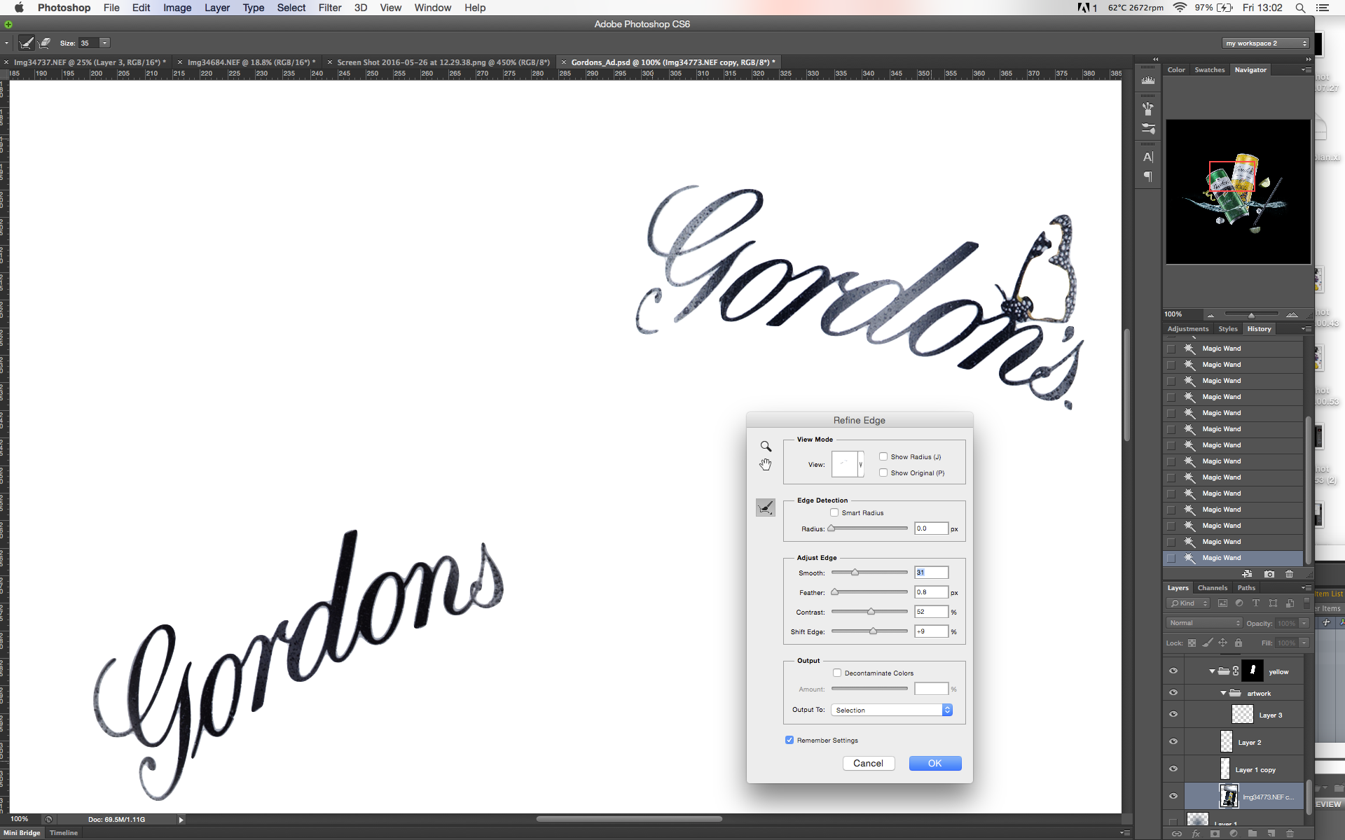
Without closing the selection, I then create a new curves adjustment layer (selection is automatically masked) and darken the text a little so it stands out a bit more. I could continue enhancing the artwork using the same methods already described, but as this is only an example I will stop here.
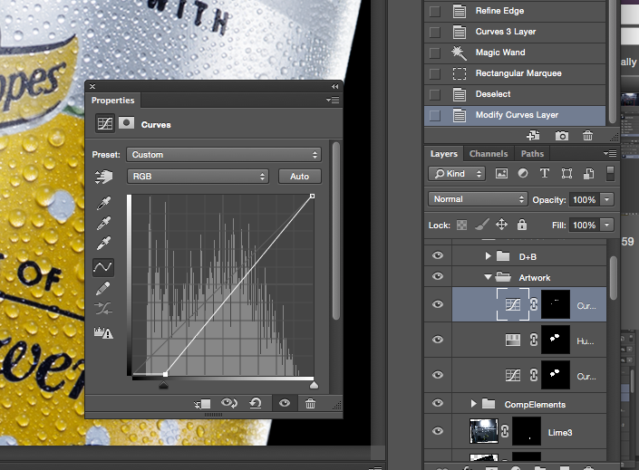
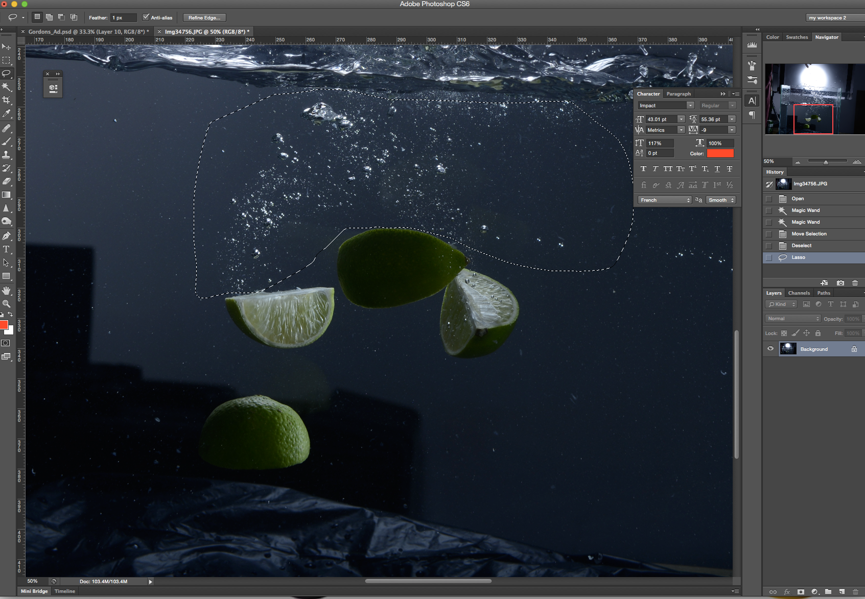
Step 12. Now to add the water splashes. I roughly cut these out with the Marquee Tool, I place them roughly where I want.
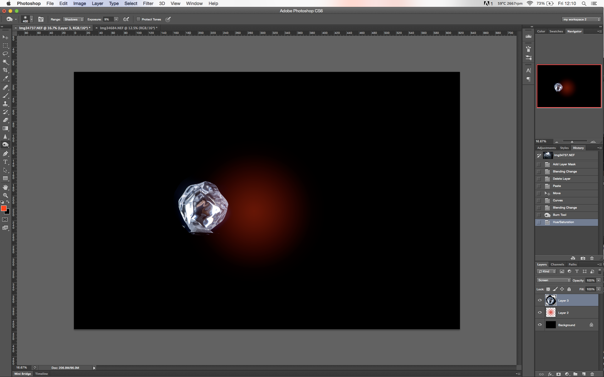
Step 13. In order to make the liquid transparent and blend in naturally, I use a Screen blending mode. In order for the blending mode to work the areas that you want to ‘hide’ need to be black (or near to). I used Curves and Dodge and Burn directly on the layer to increase the contrast and darken the shadow areas, then I apply a Screen overlay to the layer and the dark areas become ’invisible’.
Below is an example of how to use this technique.
I want some of the red background gradient to show through the ice cube because it’s transparent.
I start by increasing the contrast using Curves
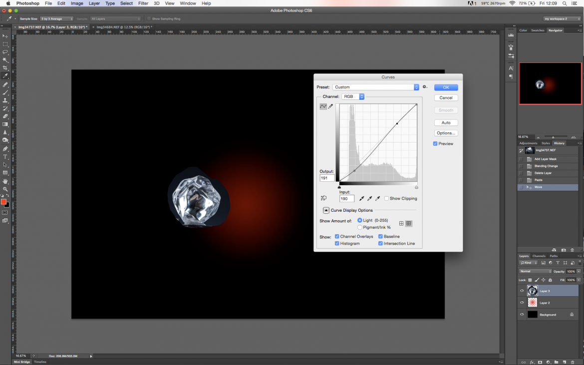
I now use a Screen blending mode on the ‘ice’ layer. Notice how the darker areas start to dissappear. However you can still see the egde where the ice was cut out because its not completely black.

So I now use the burn tool to darken this area and there you go.
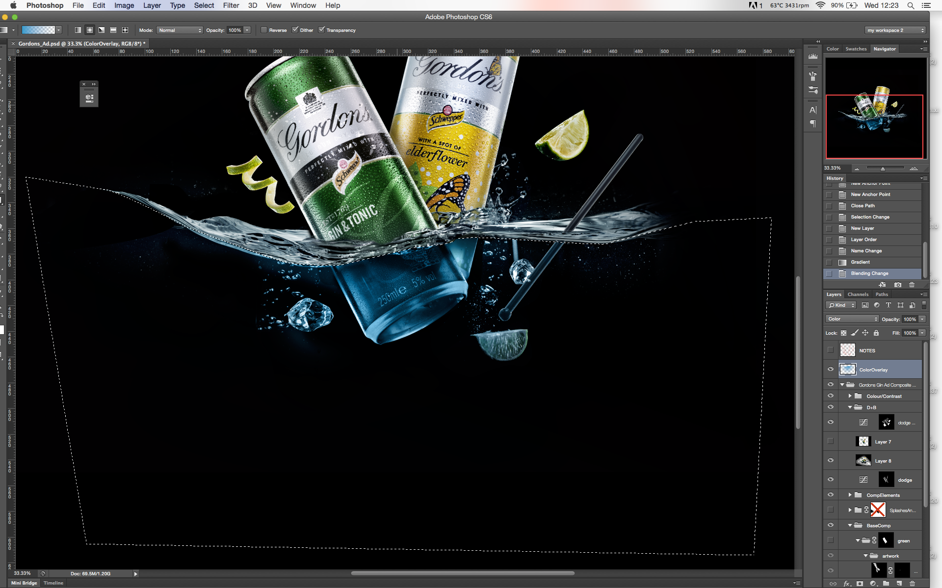
Step 14. The next stage is to add more depth and realism to the composite by adding shadows. The shadows were simply created by using a Pen Path Selection and painting in the shadows with a soft brush and then playing around with blending modes (I usually use Soft Light or Overlay) and opacity, until I am happy with the results. I don’t use black for the shadows as it is less realistic, I made a selection from the darkest point of the object with the Eyedropper Tool and then paint this over with a 100% opacity and 40% flow.
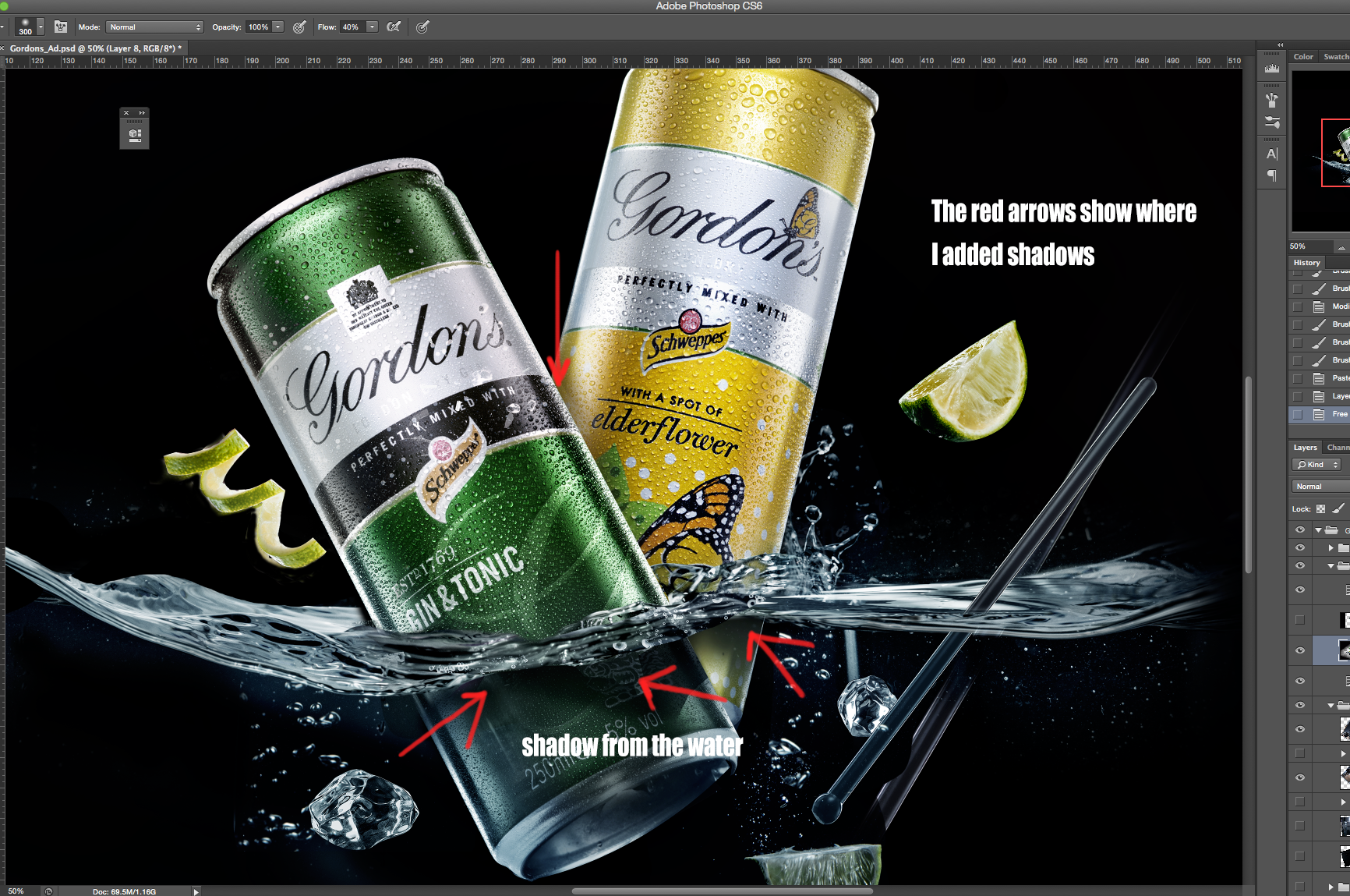
I also added the base of the can from another image and generally tidied up the image.
Step 15. I want the liquid to look icy cold, so I will to add some blue tone to the water. I start by creating a new blank layer called ‘ColorOverlay’. I then make a selection from below the water line and use the round gradient tool to create a blue gradient as below.
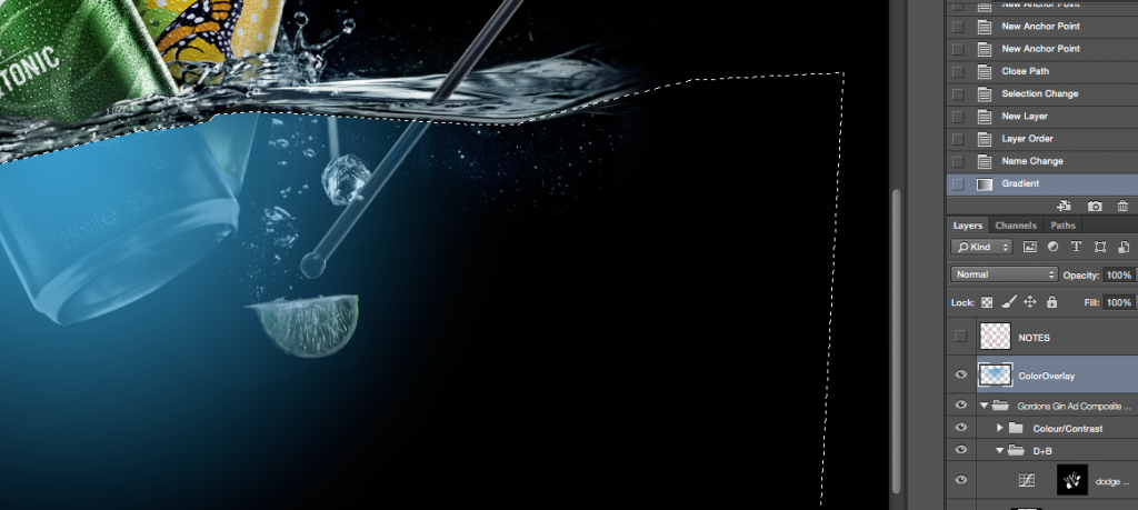
Now I select a Color from the blending options and then adjust the opacity until I am happy.
I also want to add some blue reflection to the edge of the can as it naturally pick up some of the colour. So I use exactly the same method as discussed previously.
Step 16. Now I add more of the bubbles and flying droplets – these are all taken from images from the shoot. Sections can be quick selected and added to the final composite using the same method as in Step 13.
Step 17. Finally I added some ‘ice shards’ to create a sense of something exploding out of liquid, for this effect I downloaded a photoshop ‘scatter brush’ for example here
Note: there are a load of free brushes available if you search google, but if its for a commercial job, its important to check the terms of usage for any images or brushes downloaded.
Software and additional equipment
Connect with Mark

I think the screen overlay part of the water splash is a bit too simply put here… I tried it and the water splash disappears when over the can due to the screen effect. And on a black background there is no difference between screen blend mode and normal. Maybe he masked some of the water splash and placed it over the can with a normal blend mode. Or I am doing something wrong lol
It depends on how bright your initial shot of splash. And of course, some parts of splash were masked since a can should be visible in different areas. You can post your result to our forum so we will figure out how to fix your issues: https://www.photigy.com/school/forums/forum/general-forum/general-talk/
Thanks for the reply 🙂 yeah I started to fumble around with various elements of my splash shooting and screen blended and normal blended various parts. Mainly had to normal blend and mask the water that is in front of the cans. Great tutorial and for sure will post my result in the forum!