Commercial Product Photography Behind The Scene:
The Making of Quaker Oats Series
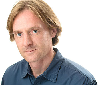
I am Ian Knaggs.
An Engineer by trade working in the Aerospace industry and have a passion for producing high quality still life and product images.
I enjoy the technical challenges of building lighting setups and particular relish the challenge of creating images without the use of expensive equipment.
I also enjoy dance and headshot photography. I am currently building a portfolio of product images with a view to soon gaining work in this field.
Commercial Product Photography: The Making of Quaker Oats Series
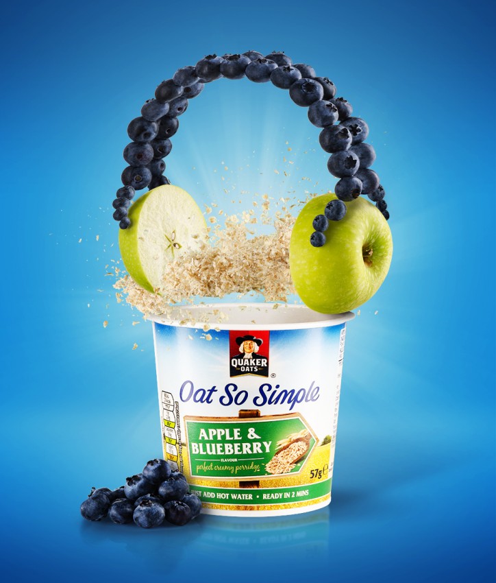
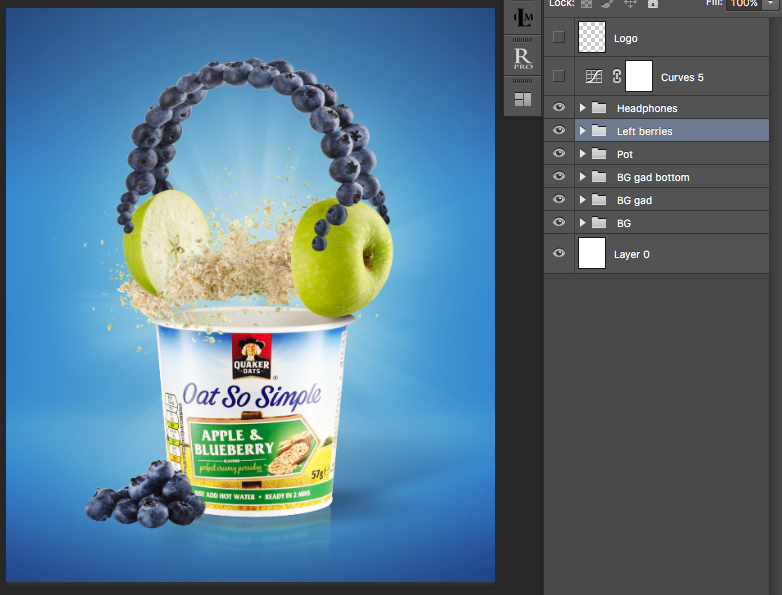
The Final Image
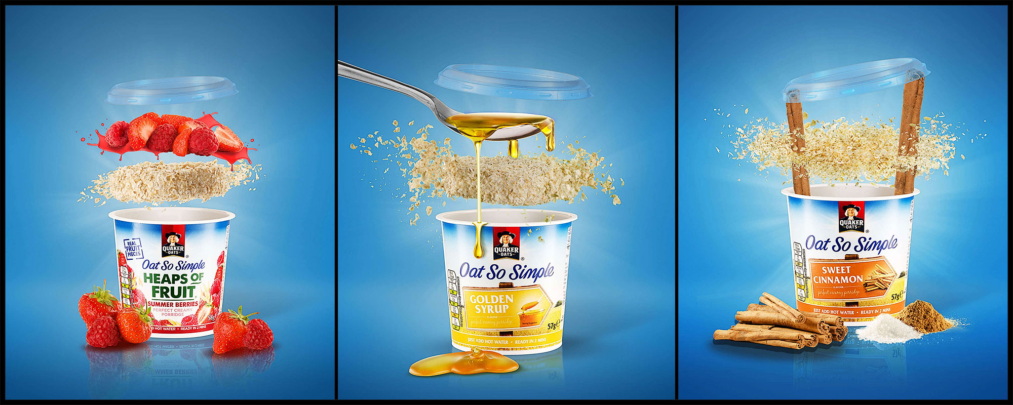
Advertising campaigns never use just a single image. They will always rely upon a series of images that use a theme that is common throughout. When I looked at my portfolio I realized that I have some technically accomplished images, but none of them were really linked. Therefore, I decided to create a series of images using a single product line, with all images having a similar look. Here are 3 out of the five images that I created for this series:
As I’d been planning to shoot some ‘floating ‘ images for a while, this seemed like a good time to use the concept combined with the idea of deconstructing of the product in to its constituent parts. After investigating the possible product options, I chose the range of Quaker Oats, ‘Oat So Simple’ range as they offered good options in terms of varying and dynamic ingredients (and I could eat them afterwards!).
I already had the overall concept and look of the images in mind and after purchasing the products, I started thinking of the details of each image in the series. This process takes time and I often sketch out ideas roughly then develop them over a period of time & I rarely shoot the first idea that I come up with.
Here’s one of the sheets of ideas that I created for this project (apologies for the handwriting!)
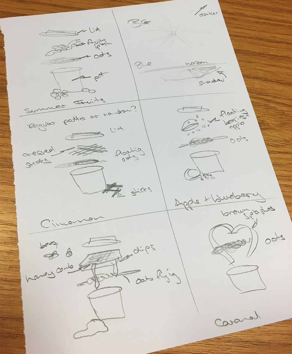
As you can see (if you can make sense of my scribbles and read my appalling writing!), my first idea for the Apple & Blueberry image was just to have a layer of fruit floating in mid-air along with the layer of oats. However, I was thinking about shooting headphones (as many people seems to have a pair of headphones in their portfolio!) and then I dawned on me that I could create my very own pair of headphones using the fruit. I started to create the image in my mind and work out the details, then it was time to get shooting!
— Shooting —
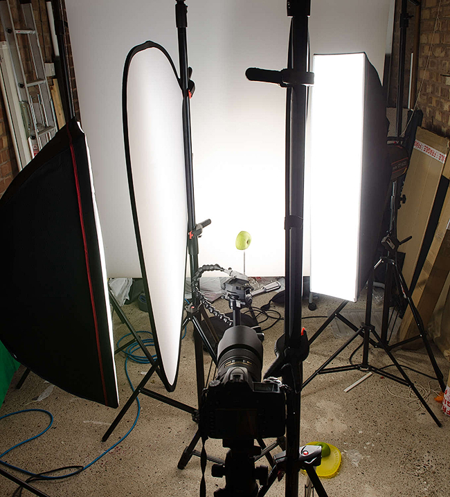
After buying the products I shot images of each pot without a lid at the same time to ensure that the lighting and camera position etc remained consistent throughout the series. The pots were shot on a piece of white plexiglass and a black background (to aid cutting out from the background) and lit using 2 stripboxes aimed slightly towards the camera through diffusers.
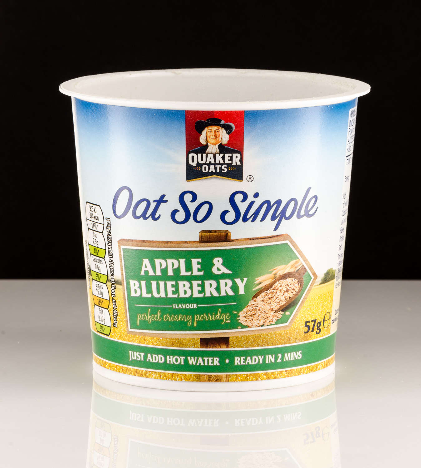
The camera settings for all images in the composite remained the same and were: ISO125, f/14, 1/250
As this was the fourth image in the series I already had sufficient images of the oats to choose from. There were two variants of oat image to choose from. The first was using a polystyrene disk that was covered in PVA glue then rolled in oats, used in the Summer Fruits image shown above. This produces a solid looking block of oats as if they have been lifted straight out of the pot. I also had a number of more dynamic images in which the oats were thrown into the air.
I ended up shoot around a total of 200 images of oats and picked the best suited for each image in the series. For this image I decided to go for the more dynamic, hand thrown oats like these:
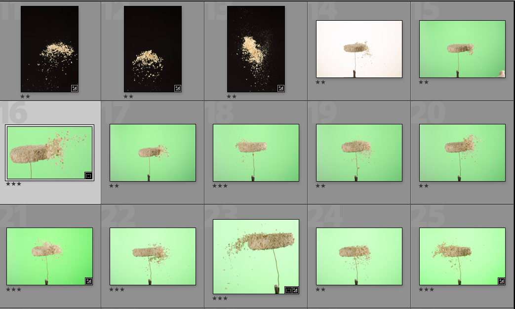
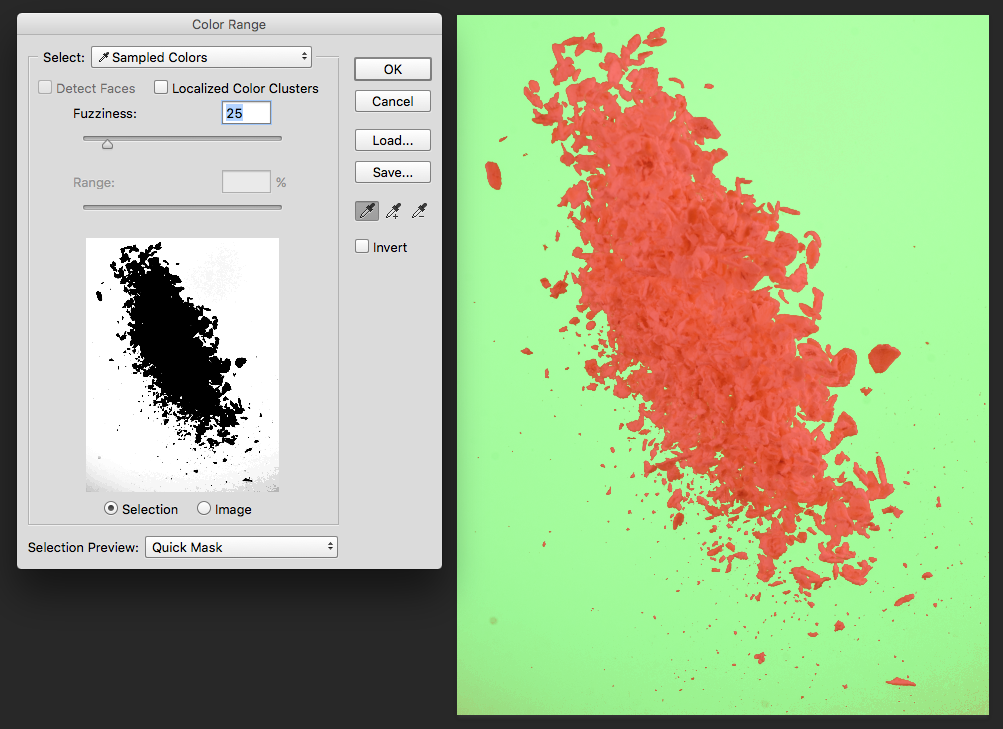
My first attempts used both black & white backgrounds, but these proved very difficult to cut out cleanly. Therefore, a green gel was used on the background light to aid knocking-out the background in post-production.
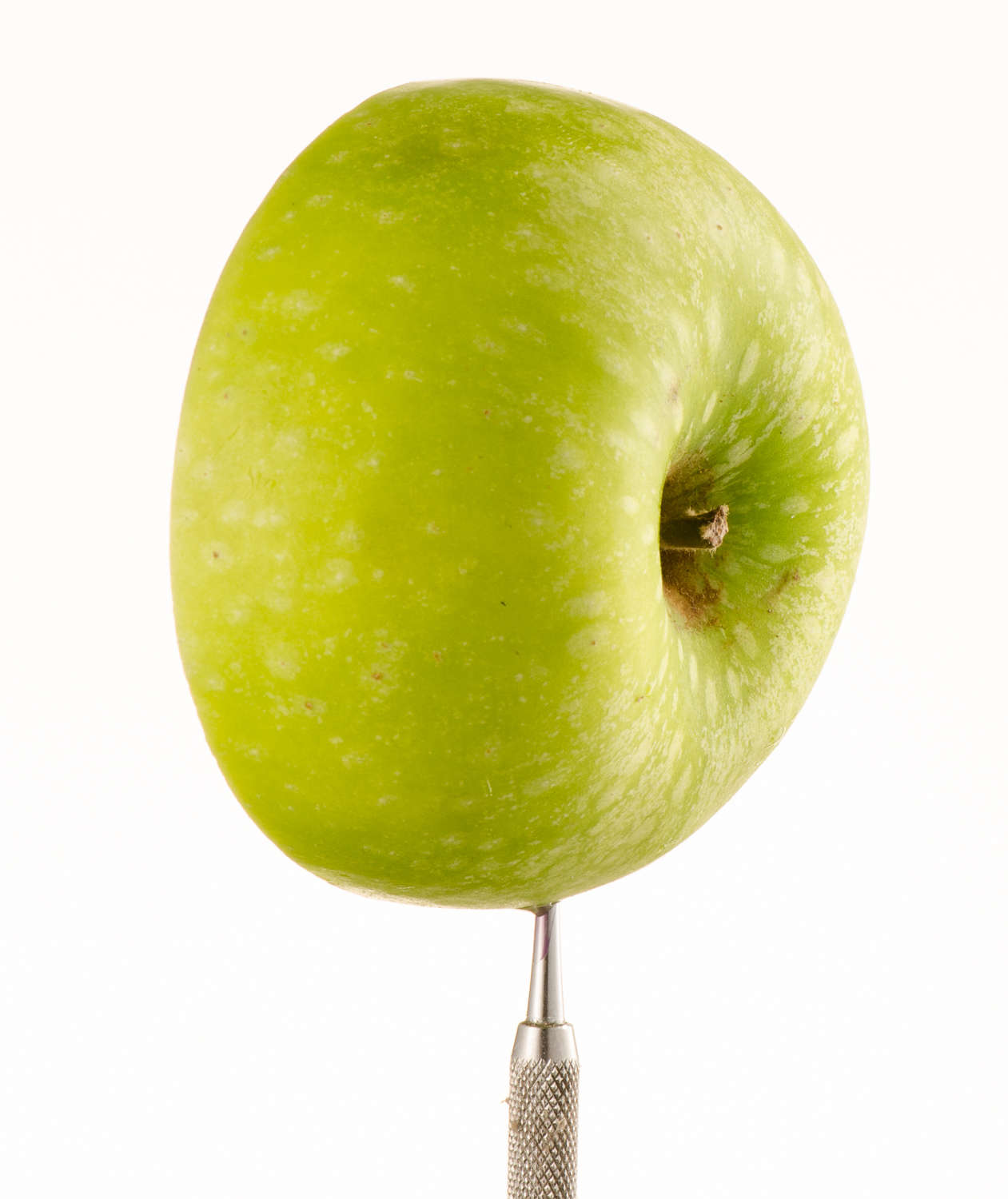
All that remained was to shoot the fruit… I knew that I needed a method of holding the fruit up so that it could be placed into the final composition and look realistic.
The apple was simply cut in half with a sharp knife and each half was placed on top of a metal tool (similar to a dentists tooth pick!) that was supported using a Plamp. This allows the light from both sides of the apple to wrap around it and removes any reflections that would be difficult to remove in post-production. I shot each apple from several slightly different angles to allow some flexibility of the composition during post-production.
The last image required was the blueberry headband. I knew that I needed a method of holding the berries in the correct position so that I could use lighting that was consistent with the rest of the images. Therefore, I decided that threading the berries onto a wire would be the easiest method which also allowed the shape to be altered easily.
The solid copper wire was removed from an old piece of electrical cable and was strong enough to support the berries yet flexible enough to allow it to be shaped easily.
A 90° bend was used to stop the berries falling off the end of the wire and the berries threaded along it. I made an effort to try and align the berries facing upwards so that they were perpendicular to the wire, however, due to the angle at which I threaded them, some berries refused to co-operate! Once threaded, one end of the wire was placed upon a small white plexi-glass (A4 size) and the other held in the clamp jaws of a Wimberley Plamp. The Plamp could then easily be moved to adjust the position of the wire.
The lighting was very similar to the other objects using strip boxes and diffusers either side. Again, lighting consistency is very important in making believable composite images. The band-of-berries was rotated through 180° and placed in the same position and another shot taken so that I had two similar, but not identical, images that could be used for each side of the headband.
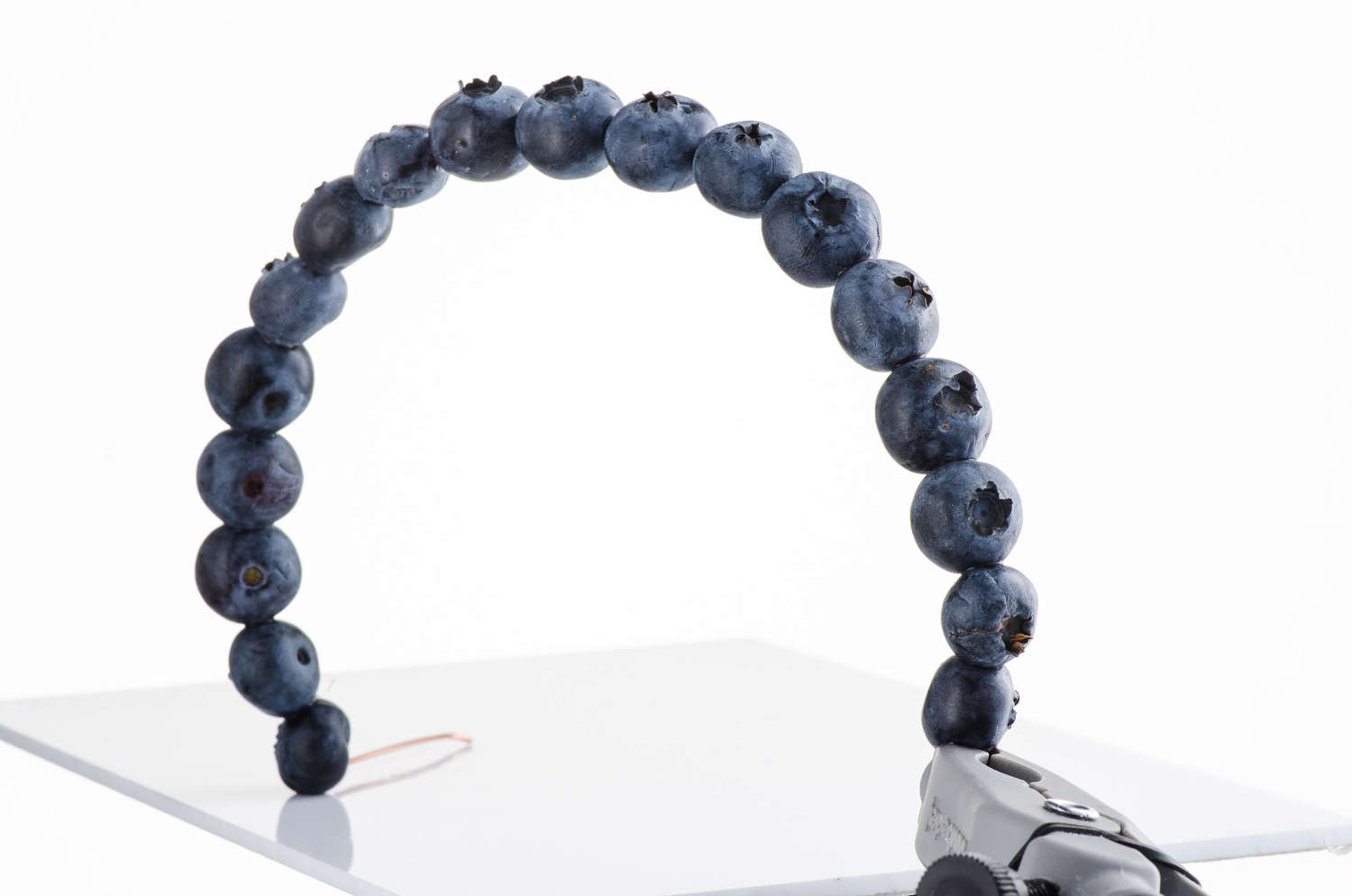
If you look closely you can see that in image above there is insufficient depth of field to cover the whole headband. Therefore, I shot 4 images of each set of berries and used Photoshop to align the images and then stack them to ensure the final image showed the headband in focus from front to back.
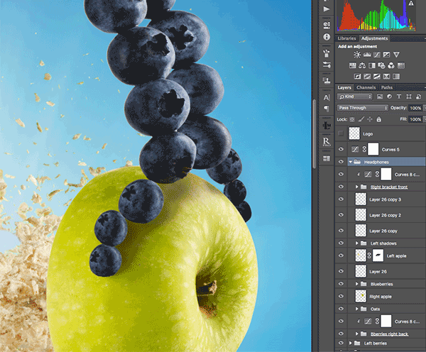
With all of the individual images downloaded from my tethered laptop it was time to get comfy in front of the computer and get down to the editing and compositing.
— Post-Production —
Basic minor adjustments such as contrast boost (using Tone Curve), Exposure, Clarity, Highlights and lens corrections were made using Adobe Lightroom then the individual images exported in.tif format and opened in Photoshop.
The background was created digitally and is the same for each image in the series. It consists of a total of 11 layers with various linear and radial gradients and a ‘light ray’ brush. I’m no retouching expert but trying to create a background using just a few layers never looks very good, so I always use plenty of layers and then vary the opacity and amount of blur applied to each layer to get the effect I’m looking for.

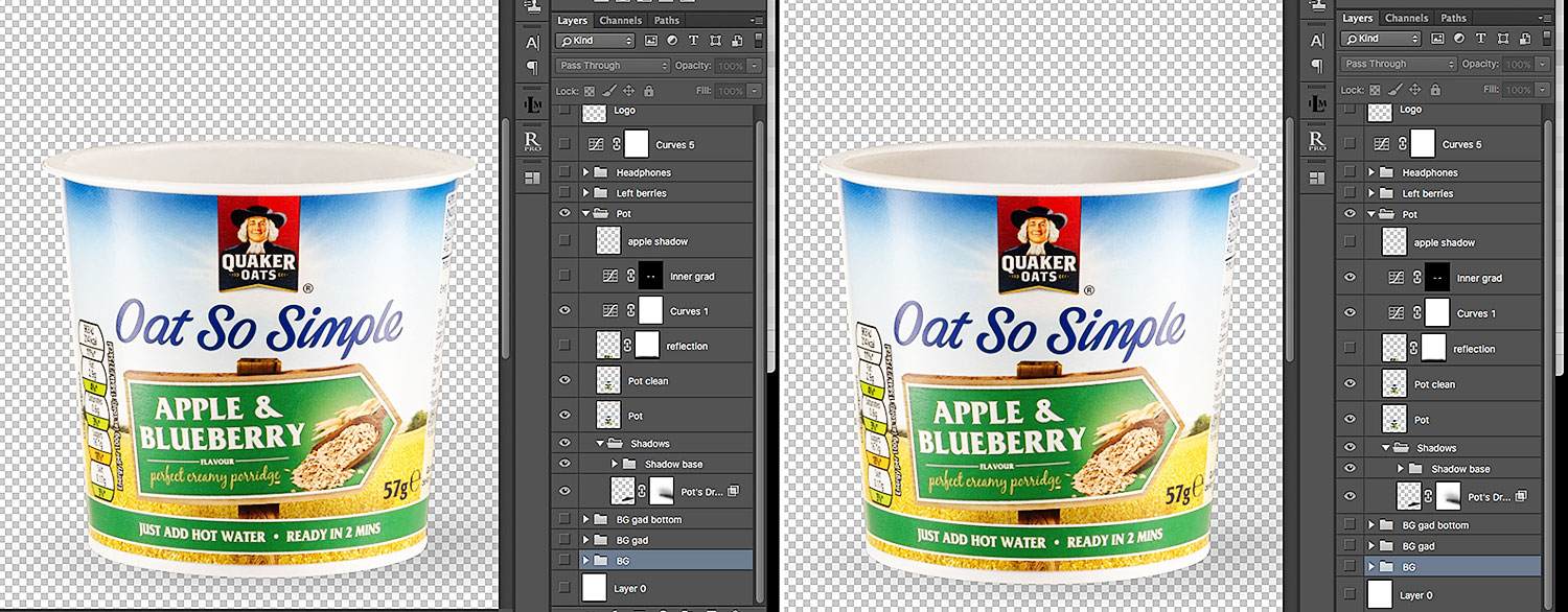
The pot: This was cut out from the background using the pen tool which was relatively simple due to the geometric shape of the pot. The pot was cleaned using a mixture of the Healing Brush tool and the Clone Stamp tool. There was very little in the way of shape or definition to the inner edges of the pot, soI made selections of the inner area and two gradients were added to increase the feeling of depth.
Oats:
These were one of the most difficult components to cut out. I originally shot them against a white background but there was insufficient contrast to make decent selections. Therefore, I started shooting with a green gel on the background light to aid knocking out the background. I first used the Color Select tool to select the greens in the image then refined the selection to remove the slight green halo around the oats that this left.
A fair bit of juggling was required to get this right and, if you look carefully, there are still some areas with a slight green cast to them! With hindsight I should have perhaps used a blue gel behind the oats to help them blend in. The final image used 2 separate images of the oats. Once the two images were placed over each other curves layers were used to match the color and contrast of each layer.
Due to their shape, the apples were easy to cut out from the background using the Pen Tool. These were then positioned above the pot in the composite image. The headband of blueberries was cut out from the background using the Color Select tool as shown above. This produced a reasonable selection which was then refined by reducing the selection and adding a little feathering which removed the slight white halo around the berries.
General:
With all of the individual images prepared they were positioned on top of the pre-prepared background image, placed into labelled groups to allow for easy identification, and their positions tweaked until they sat nicely together. A few of the elements required a little use of the Transform tool for them to sit correctly.
Once I was happy with the composition the finishing details were added. These included the addition of shadows under the blueberries on to the apples and also under the blueberries at the front. These were simply painted onto a blank layer using a soft brush with 100% opacity and 5-10% flow using a color sampled from the apple skin which was then darkened from the Color Picker dialogue.
The finishing touches were a little sharpening and a overall curves layer to adjust the contrast. I then posted the image in the Photigy Facebook group where I received some very helpful comments. I made a few additional changes as suggested by fellow Photigians (many thanks to all who commented and especially Max Bridge, Ori Livney and Bryant Figueroa for their constructive feedback and guidance).
These changes really made the image pop and made the compositing look much more natural. These changes mainly consisted of controlling the highlights on the blueberries. With hindsight, when shooting the blueberries, I should have turned the back-right light down significantly to give a much more subtle highlight/gradient. Also, the berries in front of the pot were shot in isolation with no pot behind them and hence they had a bright highlight on their back edge.
When placed into the composite image the pot behind the berries should have blocked this light source and this highlight looks out of place. When I have some more blueberries I will reshoot these correctly and add them in. However, in the meantime I cheated and darkened these rear highlights by using a soft brush in Photoshop.
— FINAL IMAGE —

I hope that this has helped you to understand the process involved in producing a complex composite image and give you confidence that it can be achieved with relatively little specialist equipment. The important fact when approaching compositing like this is to keep the camera position relative to the subject the same throughout and (in most cases) keep the lighting the same. This makes for a much more believable final image.
I hope that it inspires you to look around for product ranges that you see everyday and go and create more than just a single image, make you portfolio stand out and create a s series of images – it may just set you above the competition!
 |
In the Gearbox |
|
Equipment Nikon D7000
|
Connect with Ian
If you have any questions regarding any of the above just ask & I’ll do my very best to answer them!
You can find me at any of the following if you want to keep in touch and follow my work:
website: ianknaggs.com
Instagram: instagram.com/ik_product_photography
Bechance: bechance.net/ian.knaggs
LinkedIn: https://uk.linkedin.com/in/ianknaggs
