Product Photography Behind The Scene:
The making of ”Papo Seco” wine
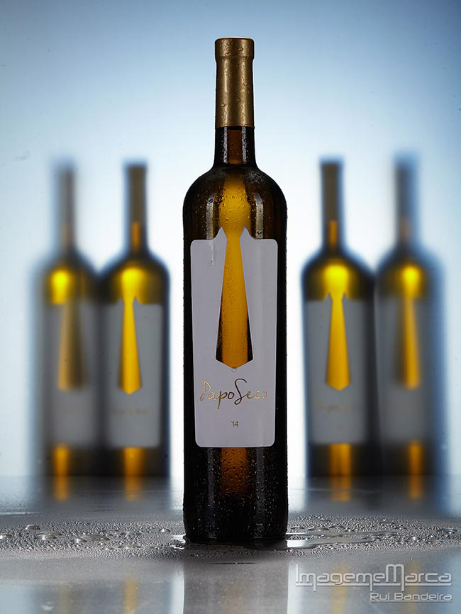
The complete BTS of creating a ”Papo Seco” wine bottles shot from Rui Bandeira
It’s a honor to be published on Photigy, and I hope my behind the scene will help those of you who is interested in learning a creative product photography.
My name is Rui Bandeira, I’m a photographer from Porto, Portugal. I really love product and commercial photography, but I also love concert photography.
I’m an ex drummer and I’ve always had a passion for image and photography.
I used to have a music teacher that said: “In music there are no teachers or students, only students, and those who know more teach those who know less …”
I think the same about photography.
The ”Papo Seco” wine
Photographing the ”Papo Seco” wine: Behind The Scene
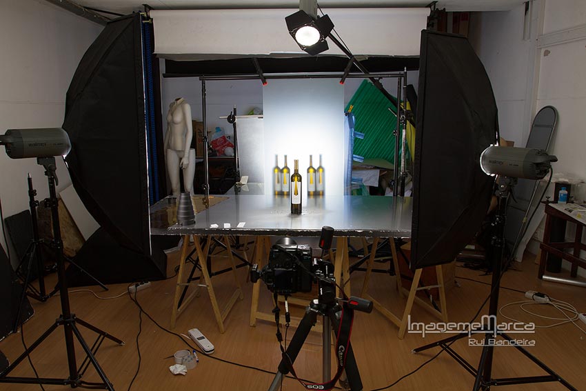
For this shot I only had the 5 bottles my client gave me and the idea he wanted for the image… he wanted “fresh” “clean” and “young” he also needed some blank space for adding text later on…
In the beginning I was thinking on using only one bottle…but as I had 5 bottles available I decided to try to use them all. The first thing I knew I wanted to use was the metal sheet for the bottom, because I wanted to use some water, and the background paper was out of the question, I already knew that the metal sheet would look good and fresh with the water.
Now I would have to come up with some idea for the back…and that was the moment that I remembered one idea that I had for a shoot some months ago… so I pick up my phone to see the image of the idea that I saw…
This was the image
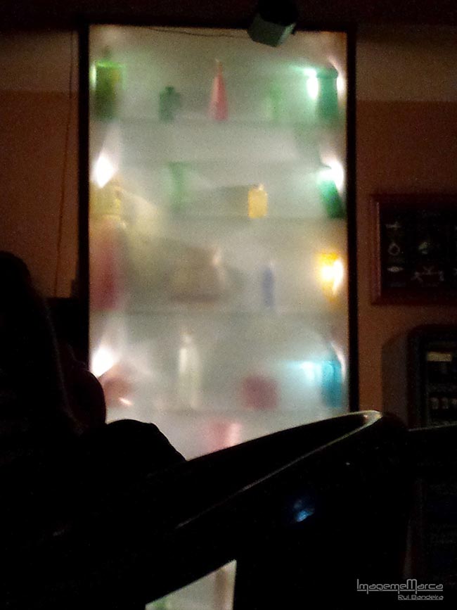
This image was made one night on a local pub…I was there with some friends and while we were waiting for a table I saw what seemed to be the back of a glass cabinet that was full of bottles, and I just loved the effect, so I took a pic with my phone with the intention of using it one day in one shot…
…this was the day
This is the proof that we can find inspiration everywhere anytime.
So now that I had the idea I just need to start building it .
I had the matte glass from an old desk, so using the backdrop tripod I mounted it in place.
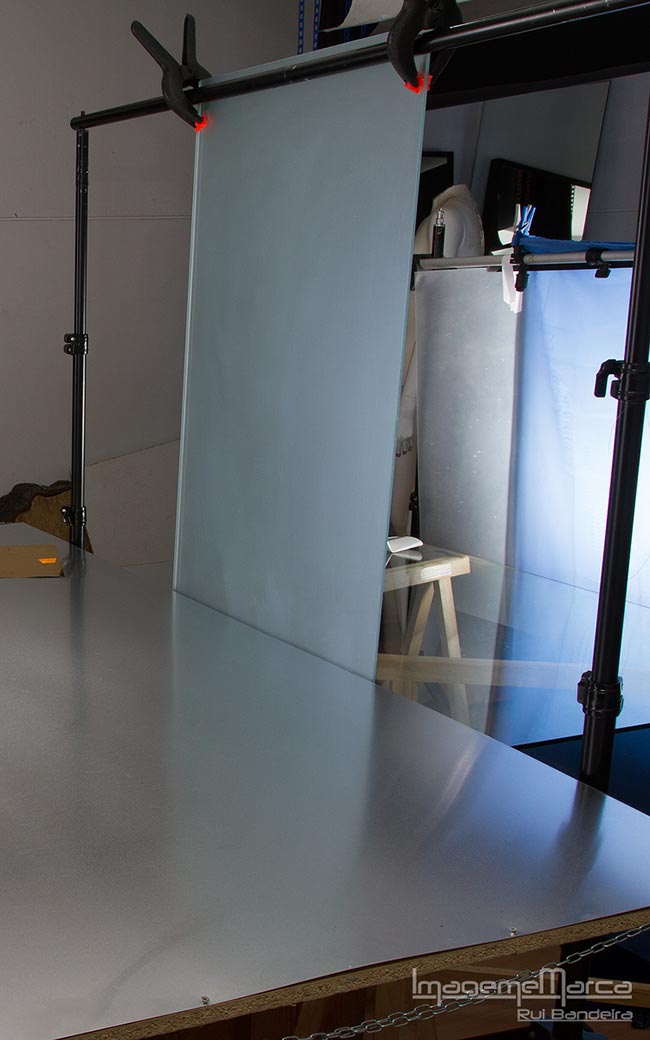
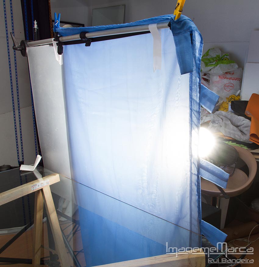
I knew I had to back light it, but I also wanted to give some color to the background…blue was my first option because to me, blue is fresh…
To do that I used a flash with a panel on the back and I used some matte plastic to give it some diffusion, for the blue I used some gels, but wasn’t happy with the results, so I decided to try some blue curtain, and just loved it.
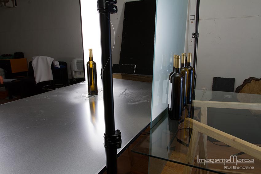
Now it was time to take care of the bottles.
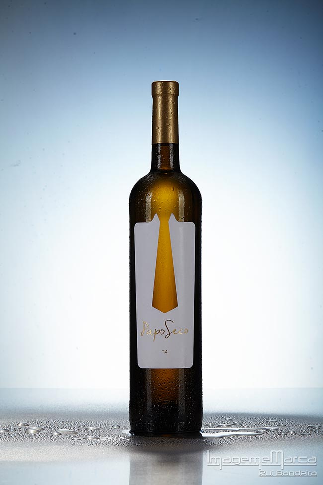
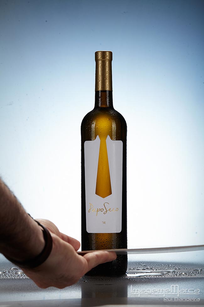
I started by removing the back labels from all the bottles using a knife and some alcohol, then I cleaned them all and started to select the best one to be on front. The bottle on the front would have some water drops.
To do that I used a mix of water and glycerin and sprayed it on the glass.
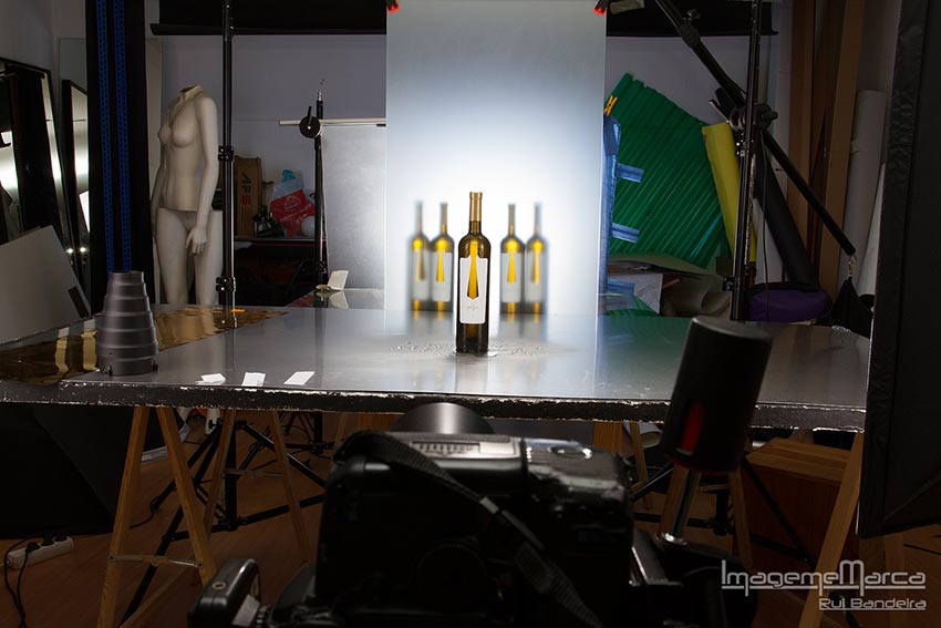
I decided to shoot it at f/16 to have all the bottle in focus and that was not a problem for the background because the matte glass would give enough blur…
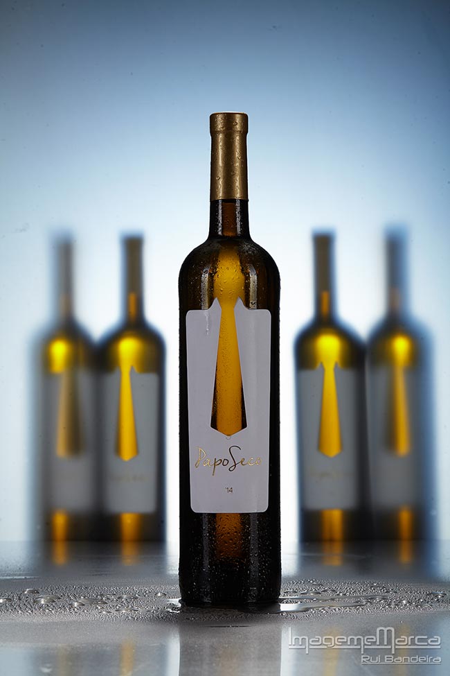
I started to look for the best place for the bottles, the back bottles I didn’t want them all at the same distance, so I decided to have 2 in the middle close to the glass and the 2 on the outside away from the glass to make it more interesting.
After checking they were all in place I’ve spayed some water on the base of the front bottle.
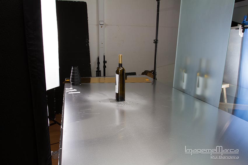
Now I had to light the front bottle.
The first light was the overhead, that was a panel with a grid to give some light to the top of the bottle and also some light on the water on the bottom of the bottle…
For the front of the bottle and to have light on the label I used 2 stripbox , one in each side, the striboxes also added some light to the front of the bottles on the background.
At this point I had something like this…
That was ok for the base image, but it wasn’t finished yet…
The composition was as I wanted…the bottles were in the place I wanted and at the distance that I wanted…
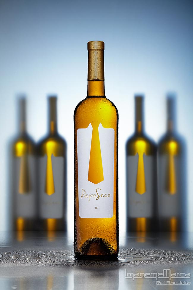
But the interior of the front bottle was too dark…remember that I was shooting at f/16, ISO100 and at 1/125…
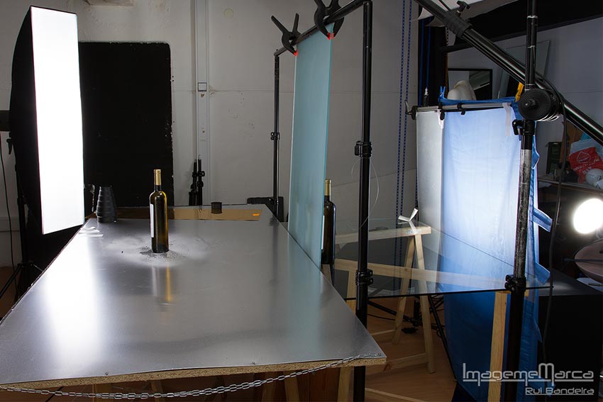
To solve this problem I had to put some light inside the bottle and them compose it in photoshop… but I also needed to start shooting without the bottles on the back because the client would probably need one copy of the image with more space to had some text, and because the bottles on the back were reflecting on the front bottle.
So only now I started really shooting the images I needed.
After marking the positions of the bottles on the back I remove them and started shooting…all was left in the same place except for the back bottles…
I made the first image with the backlight, the stirpboxes and the overhead.
This was my base image…
I needed some more light on the lettering of the label. So I used some white card…and my beautiful hand :- )
After getting all the images for the label I started shooting the interior of the bottle, also using the white card. I removed one of the stirpboxes and changed it for a panel and moved it closer to the bottle pointing to the card.
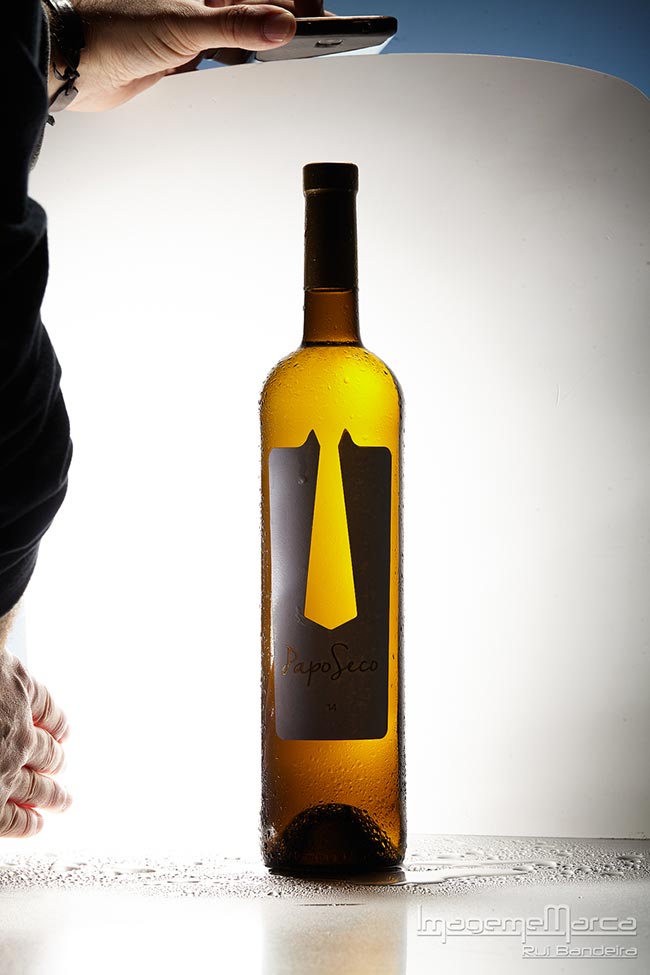
Dam…I have beautiful hands :- )
I made several images for the interior of the bottle until i was convinced that I had all the images that I needed to compose them.
Then the final image was the one for the back bottles. I just put them back in place and made the final shot.
Now I had all that I needed to go to photoshop and compose it all into one image.
 |
In the Gearbox |
|
Canon 100mm f/2.8L Macro IS USM Fall images captured to CaptureOne edited on CaptureOne and exported as Tiffs to Photoshop. |
