Building Your Photography Portfolio:
Diary of a Product Photographer
Author: Vadim Chiline, owner at EpicMind Studios
Many photographers, from beginners to seasoned pros, continuously need to work on their portfolios. Some of you might have areas that are very strong, while some others are either still green, or in need of additional content. One of the ways to increase your image count is to go out an buy some items and “invest” into your portfolio.
Scroll to the end to watch my video, or if you prefer, you can do it old school and read! : )
Last week I decided to produce some new images involving nail polish. I wanted to create new images in my cosmetics section and…. have fun! Shooting different objects, or trying different techniques is what makes photography fun and why we do it no?
I encourage you to see my previous video about taking the time to have fun at work and use times which are a little slower, or in between jobs to produce new work.
I went to my local makeup store with my staff and we ended buying several bottles of various nail polish brands. I decided to buy a few more pricey brands, and similar colours in the cheaper variety that I could easily waste and not feel like I’m pouring money onto the shooting table.
The more expensive bottles were the showcase bottles, to which I added the cheaper liquids around it to produce the various images below. All these images were produce in one day. We sat and planned out our images drawing them out roughly. The general theme of the shoot was Pantone’s 2015 Spring/Summer colour palette. The importance of keeping up with trends is really important I believe – be it colours, styles, feels. Here are the images with a quick rundown of the ideas behind them.
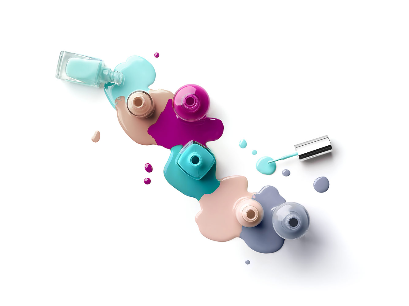
The Puddle of Colour:
The image Puddle of Colour was our first image of the day. We spent some time looking at various images here and there and saw several with objects sitting in liquid, powder, etc. We decided to take a stab at it. We first created the image with the bottles on the table and took several dozen shots to find the best composition. I wanted a horizontal one, and we worked at it until the image was pleasant.
Once the composition was good, we took a paper to our computer screen and traced out the shot and drew out the general puddle shapes we wanted. Because the light was coming from top left, the puddles had to sit mostly to the left of the bottles, otherwise, the shadows would cover too much on the right.
One-by-one puddle at a time, we lifted 2 bottles and poured nail polish, proceeding until done. Photoshop was used to clean up puddles, edit colours and any blemishes.
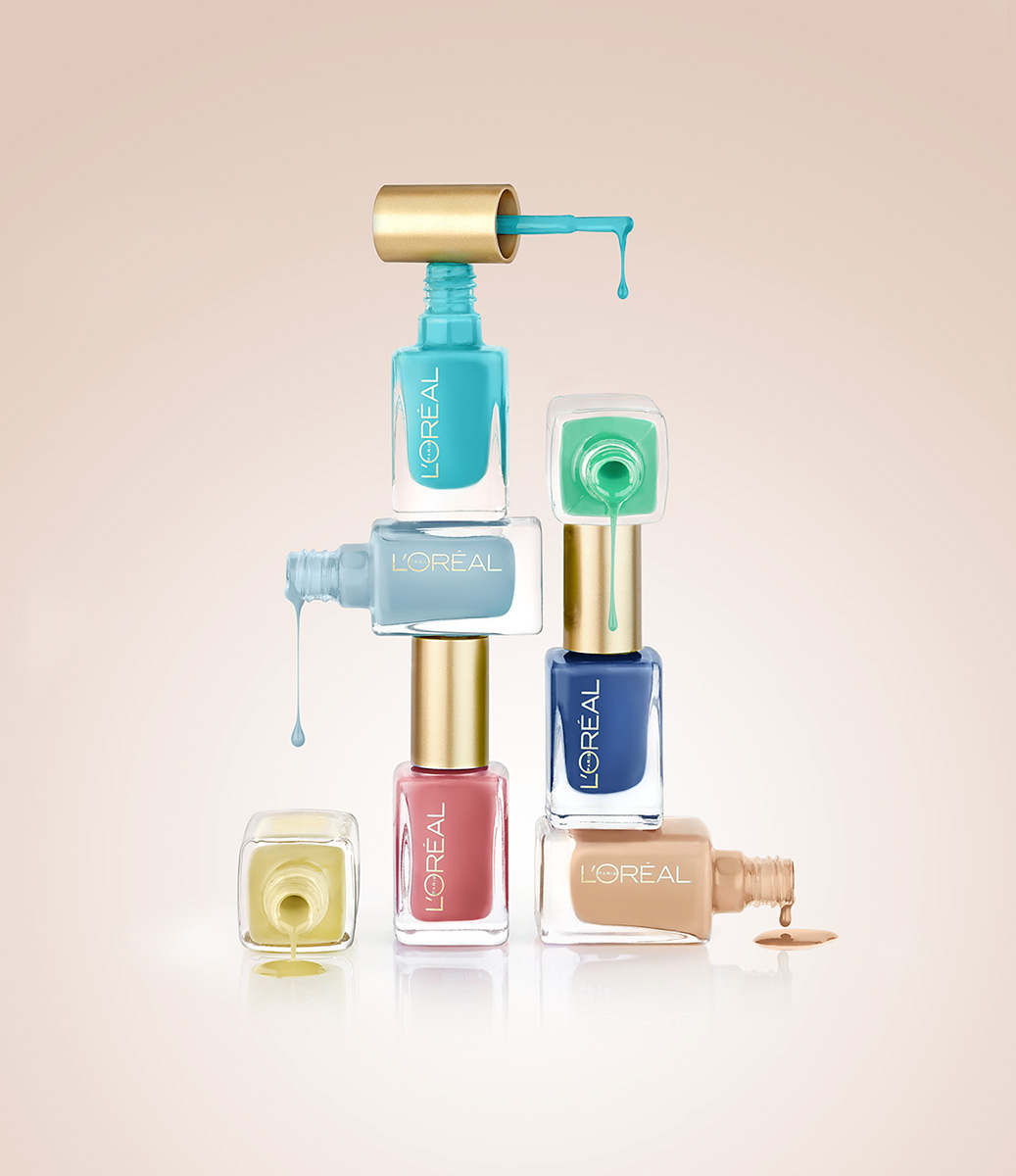
The Wall of Polish:
The Wall of Polish shot began it’s life on a table with a bunch of L’Oreal bottles where the general architecture of the shot was done and played with some orthodontic wax and patience. Once we all liked it, we reproduce it and light it. All bottles were originally closed. We opened one bottle at a time starting from the bottom and moved up from there. As the bottles opened, we took a series of images of the drops, puddles being created. Once done, we closed, cleaned up and moved on. Photoshop was used to composite the multiple images together, to clean and edit colours.
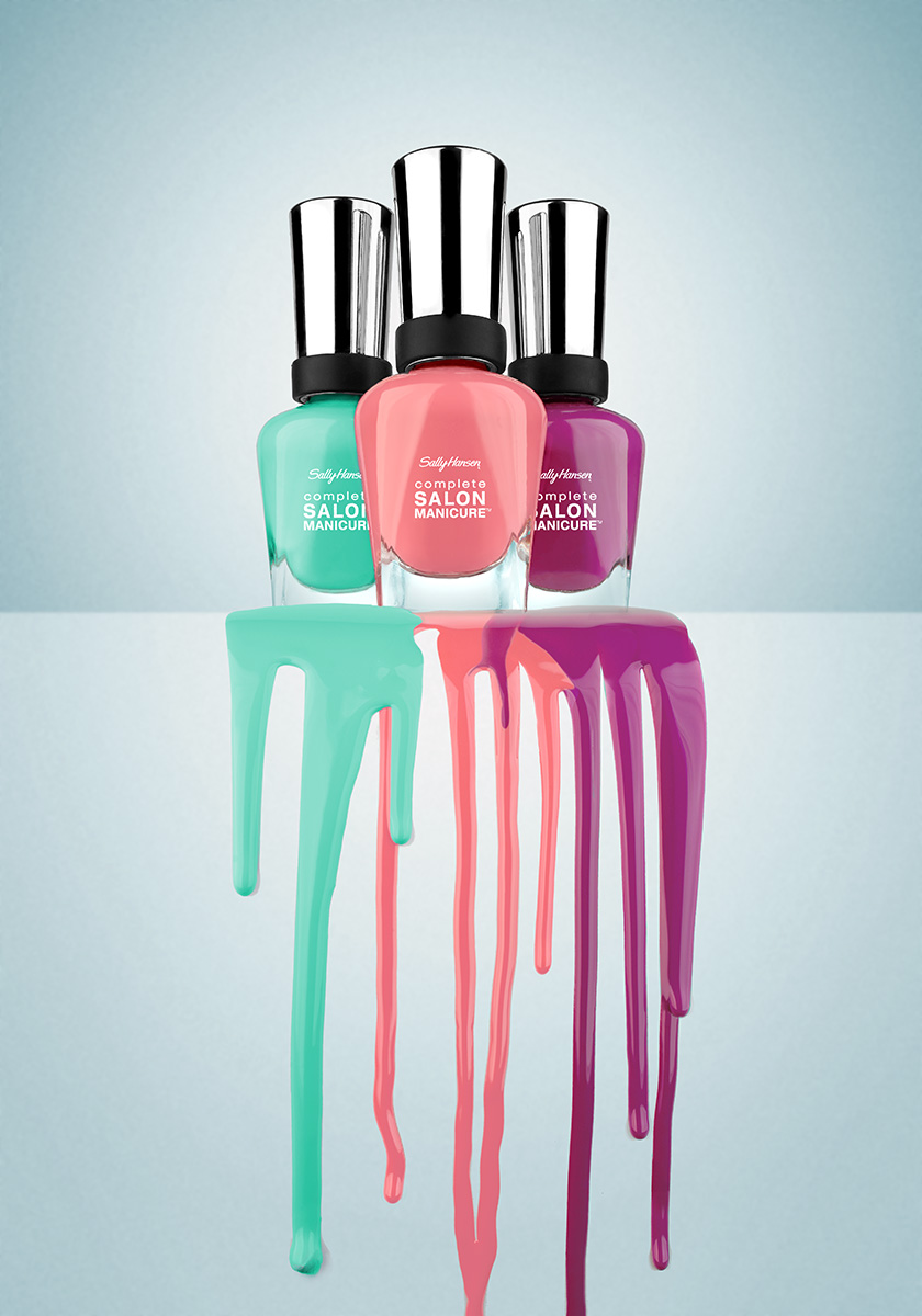
A Waterfall of Colour:
A Waterfall of Colour was an idea I came up with while on lunch and on my couch at work. I saw this image, pretty much as it stands right now. Bottles that are standing at the top, with a flow of polish flowing from them down an incline. The use of bottom-up camera perspective distorts the image and increases the “stature” and importance of the actual Sally Hansen bottles. The image is a composite of several images: The bottles; the falls. Photoshop was used to edit colours, edit blemishes, etc.
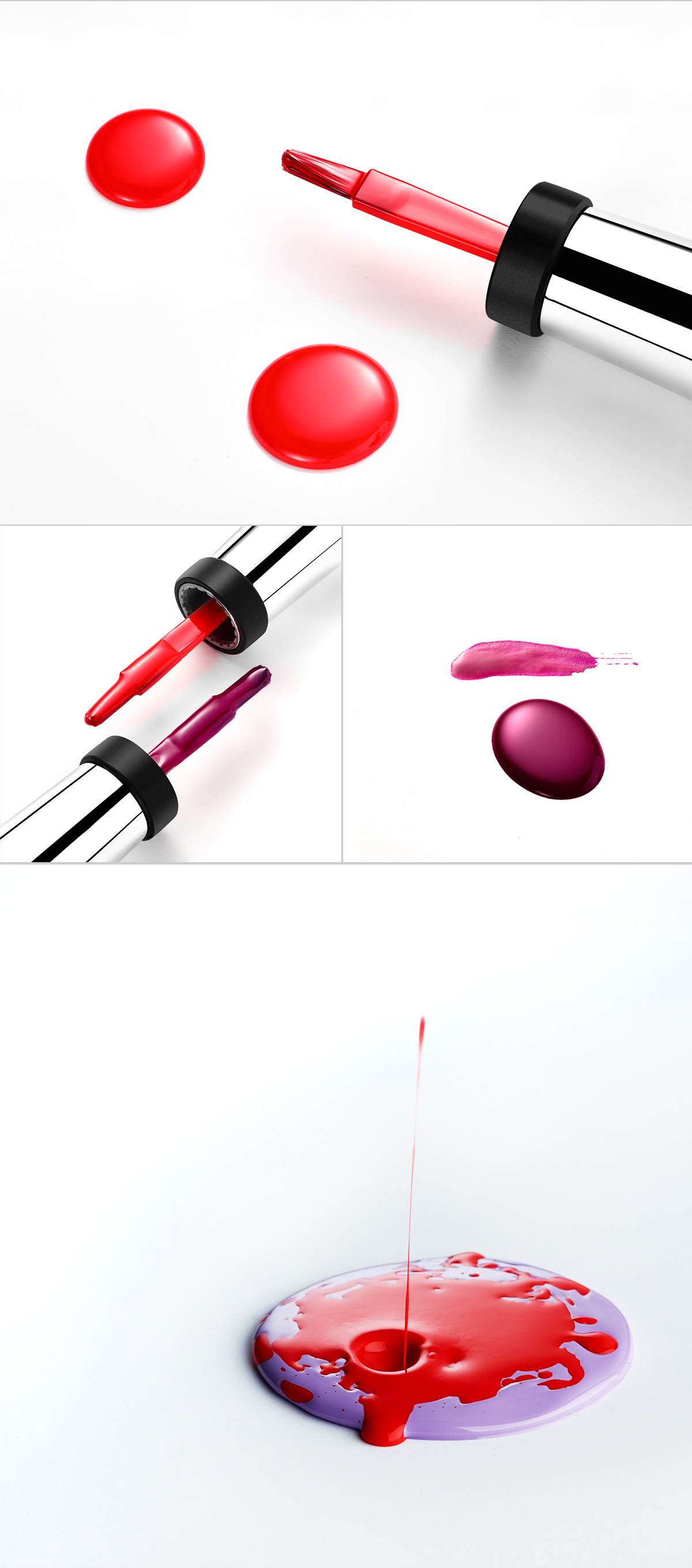
The following series of images is basically just some “fun” images I would say are more a study of geometry, shape, colour. I had fun with the remaining nail polish liquid by doing various tests. It’s always inspiring! Keep on shooting!

