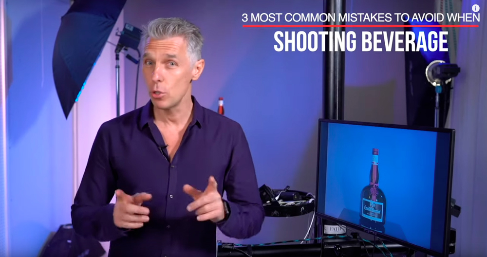
Three Most Common Mistakes to Avoid When Shooting Beverages
Tips & Tricks to improve your product photography
Three Most Common Mistakes to Avoid When Shooting Beverages
A three-part mini-tutorial
In this mini-tutorial, Alex explains the most common mistakes photographers make when shooting beverages and how to avoid them. So, whether you’re shooting beverage bottles or glasses, or anything with glass that is glossy, these tips are going to get you shooting like a pro in no time.
And if you prefer a written version, we’ve got you covered below.
Part 1
Part 2
Part 3
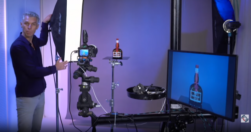
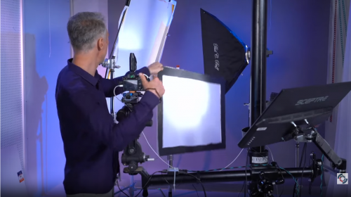
Step-by-Step Tutorial: Video 1
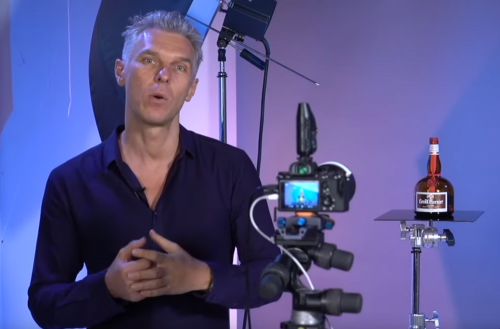
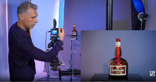
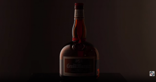
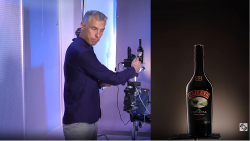
We’re going to assume your goal is to achieve a nice, clean commercial-quality image featuring a liquor bottle sitting on a glossy surface as shown.
You’re going to take complete control of your shot by setting your camera to manual mode and manual focus.
To start, the camera settings are: f/13, 1/160 sec, ISO 100.
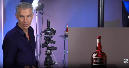
You want your ISO set as low as possible (some cameras have a “native” ISO for its particular sensor that may be slightly higher than the lowest available setting; read your owner’s manual to know the best setting). Note: do not use an auto ISO setting because the camera will try to compensate for the exposure without taking into consideration the output of your strobe lighting.
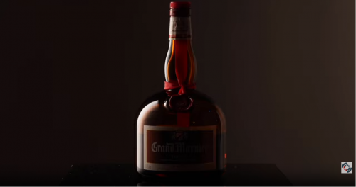
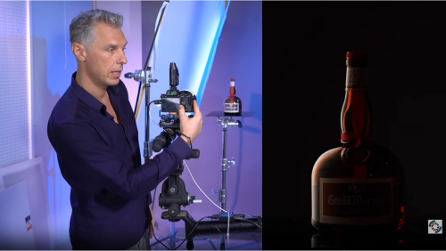
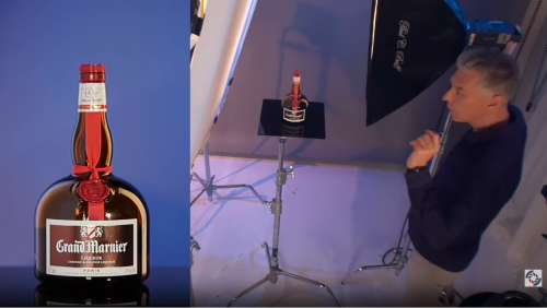
So, what happens if you point a standard bounce umbrella that works great for people portraiture at a glossy object like our bottle?
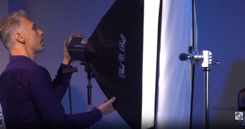
You get some nasty reflections, which is the First Most Common Mistake: not using the correct modifier for the subject.
Not only can you see a reflection of the umbrella, you can even see the strobe head. Definitely not what we want. The first step toward fixing this mistake is to use a softbox with a shape that will create a pleasant reflection. Most often, a strip softbox will be the best choice. You get a much nicer reflection and better control over the light spill onto your background.
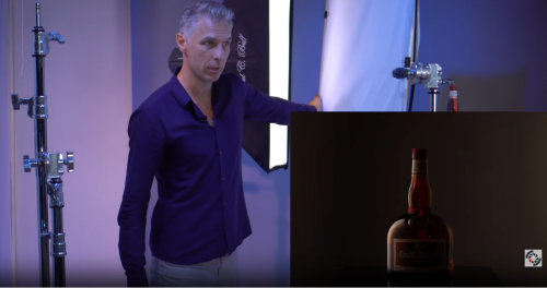
Unfortunately, with just a stripbox, we don’t really get a good sense of the shape of the bottle. The simple fix is to use a diffuser to create gradients with our lights.
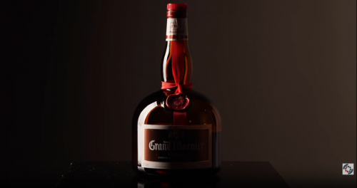
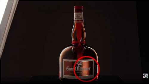
The gradient certainly helps better define the curved shape of the bottle, but it introduces the Second Most Common Mistake: making the glass look matte and not glossy. To fix this problem, we need to make sure we create a sharp edge along one side. Alex calls this the “sharp cut of line,” which you can see in the picture below.
The trick is to place one edge of the softbox closer to the diffuser so that it just touches. By changing the angle of the softbox with respect to the diffuser, you can adjust the size of the gradient.
Okay, this is better, but far from ideal. We still have two problems. The first is that the light is too intense, so we’ll drop the power on the strobe. The second is that the dark edge on the bottle is too thick. To fix that, we’ll just adjust the positioning of our softbox/diffuser combination relative to the subject.
Take a close look at the above image on the left. Notice how we have moved the softbox away from the diffuser? How did we still get a sharp line and maintain the glossy appearance of the bottle? Alex cleverly took advantage of the edge of the diffuser so despite moving the softbox away from it, the diffuser itself helps create the sharp line and the spacing of the softbox and its relative angle to the diffuser creates a beautiful gradient.
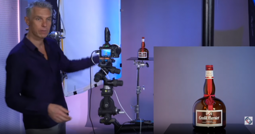
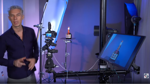
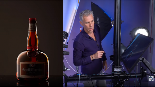
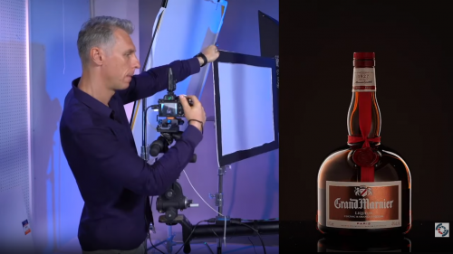
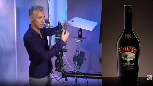
Step-by-Step Tutorial: Video 2
In this segment, we are going to continue working with the bottle, adding light to the other side as well as the label. But before we do that, there’s another little trick you should know: how to ensure your dark edge gap maintains a reasonably consistent thickness as it flows from the wider bottom part of the bottle to the narrower neck. This is a common situation with many glass bottles, especially wine bottles.
The problem arises because the angle of the bottle goes from vertical to almost horizontal at the transition, which affects the reflection of the light source.
The solution is simply to tilt the lighting set up until the dark edge gap becomes more uniform through the transition.
Now it’s time to add a light to the other side. You might be tempted to try using a gridded spotlight or fresnel light for this, but take a look at what happens:
We’re getting some light on the label that isn’t too bad because the label isn’t glossy, but the light creates nasty spots on the glass. So what do we do? You might be thinking, “Add another stripbox and diffuser,” since that worked well for the first light. And you would be partially correct. We do need to add another stripbox, but we don’t need another diffuser.
Why? Because the reason we added a diffuser to the first light was to modify the light to create a pleasing gradient that would define the shape of the bottle. So we don’t need another diffuser with our second light.
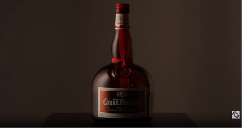
With just the stripbox, we get a sharp reflection that illuminates the right edge of the bottle. Spend a little time adjusting the position of this light to get a pleasing result. You can see the difference between the original reflection of the light in the left image above compared with the final image on the right. See how it’s thinner and more subtle?
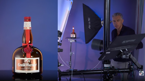
And now it’s time to light the label, which is a great time to discuss the Third Most Common Mistake: using the wrong light for different surfaces. In this case, the difference between a more matte surface (the label) and a glossy surface (the bottle).
Since we’re assuming the label is matte, we can try to use a hard spot light source.
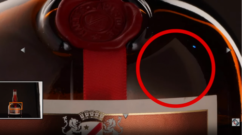
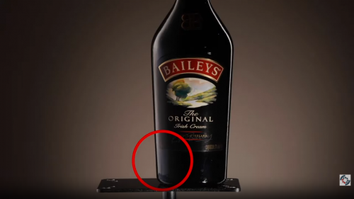
We positioned the light to try to avoid getting any nasty spot reflections in the bottle (there’s still a little bit of one to the right of the ribbon on the neck), but you’ll notice we still have some harsh glare reflecting off the label. Why is that?
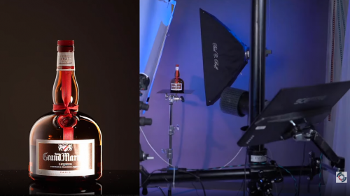
If you look carefully, you can see that the label isn’t completely matte; it has a metallic finish, so we need to diffuse our third light. While we’re at it, we’ll adjust the position and soften the focus of the fresnel lens to better fill the diffuser.
Definitely an improvement, but look closely at the bottle just above the label. See the reflection of the diffuser? We can easily fix this problem by lowering the light and the diffuser so we still get good lighting on the label without the unwanted reflection in the glass.
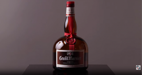
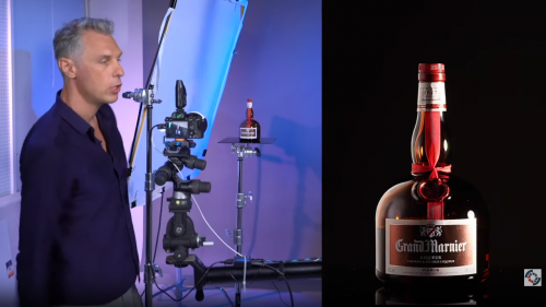
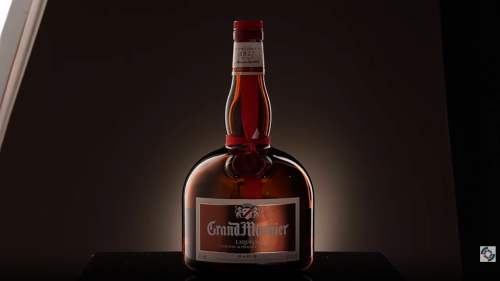
We now have a nice diffuse light on the label and the edges of our bottle are appropriately illuminated. Depending on the objective, you may be essentially finished with this image; however, we’re going to go ahead and add a background light.
So there’s our final shot before going into post-production. This approach works well for a variety of glass subjects, but will not always work.
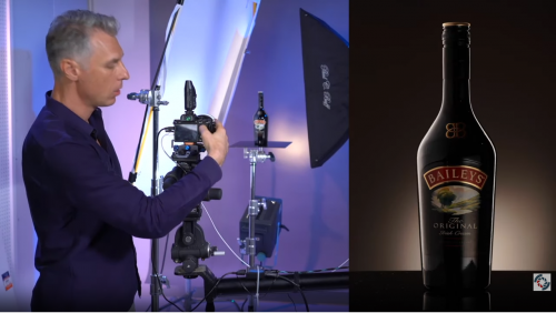
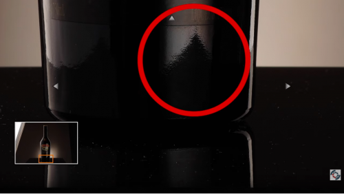
Take a look at the bottle below. The shape is different at the bottom. As a result, you can see how the narrower base produces a reflection of our table surface.
How we fix this issue is the subject of the third video tutorial.
Step-by-Step Tutorial: Video 3
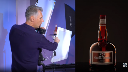
Before we get into how to fix the problem with the bottom of bottle reflecting the table, here’s a quick tip on adding a bit more light to the logo on the bottle above the label:
Just add a reflective surface (standard fabric reflector or piece of white foam core) above the cap. See how that brightens up the logo without causing any unwanted reflections?
Getting back to the table reflection issue, there are three options: (1) remove the table, (2) lower the camera to avoid the reflection of the table, and (3) use Photoshop to fix the issue. The images below show the results from the first two options:
Both solutions create essentially the same problem though: there’s no table to reflect the bottle like we had before. In situations where that isn’t important, either of these options will work.
However, if you want the bottle reflection in the table surface, you either have to use Photoshop to retouch the bottle and remove the table reflection – which could be quite difficult depending on the bottle – or you can recreate the bottle reflection in Photoshop in conjunction with Option 1. This is often the easier solution.
So are we finished?
Not quite. There’s one more tip that will help add more impact to images like these. See if you can figure out what’s different in the image below:
We did two things that can really add more drama to the final image. The first thing we did was switch to a much wider lens. We went from using a 90mm macro lens to a 35mm lens (and obviously moved closer to the subject to better fill the frame). The second thing we did was lower the camera and then tilt it back upward. The combination simply gives a much more commanding appearance to the bottle.
We hope you learned some new tricks and tips in this tutorial. As always, feel free to share your product images with us if you try out these cool techniques!