Taste the Lemon:
Radler Beer Shoot Explained (Behind the Scene)
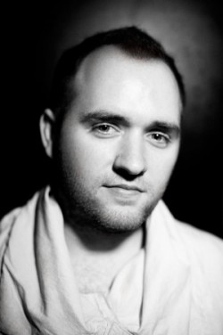 Alexey Adamitsky is an art director and retouch artist. The owner of Asiris Creative studio, he is known for his passion, unique vision, and excellence in executing his work.
Alexey is extremely experienced in producing complex hair images for a range of advertising campaigns. He knows how to achieve flawless perfection for beauty images and create a special mood for fashion stories. Lately, Alexey has been more involved in producing creative still life images for well-known brands.
His clients stress that Alexey is great to work with – he knows how to listen and execute according to the plan, making sure they get what they requested and often, a lot more!
Alexey has produced work for brands including L’Oréal, Pantene, L’Occitane, Schwarzkopf, Wella and Maybeline, to name a few. His work has also been published in many renowned magazines including Vogue, Harper’s Bazaar, Elle, Marie Claire, Zink, Lürzer’s Archive, and more.
Taste the Lemon
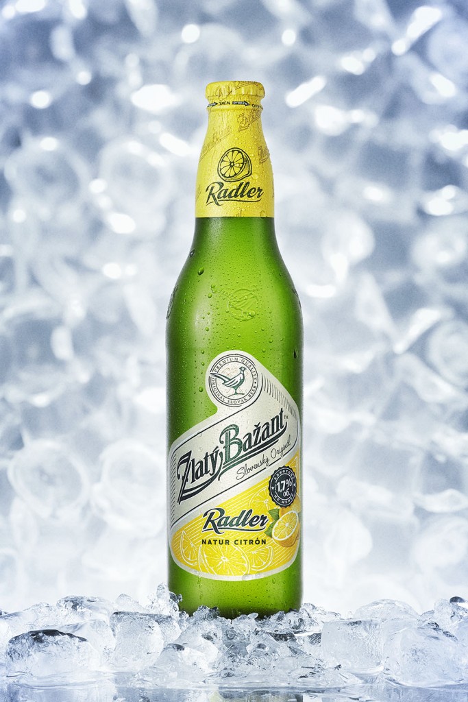
I wanted to create beverage images for a while and was searching for a good subject for the shoot. I was looking for a particular subject. I knew I wanted it to have vibrant colors and interesting package design. I stopped on Radler beer from Zlaty Bazant.
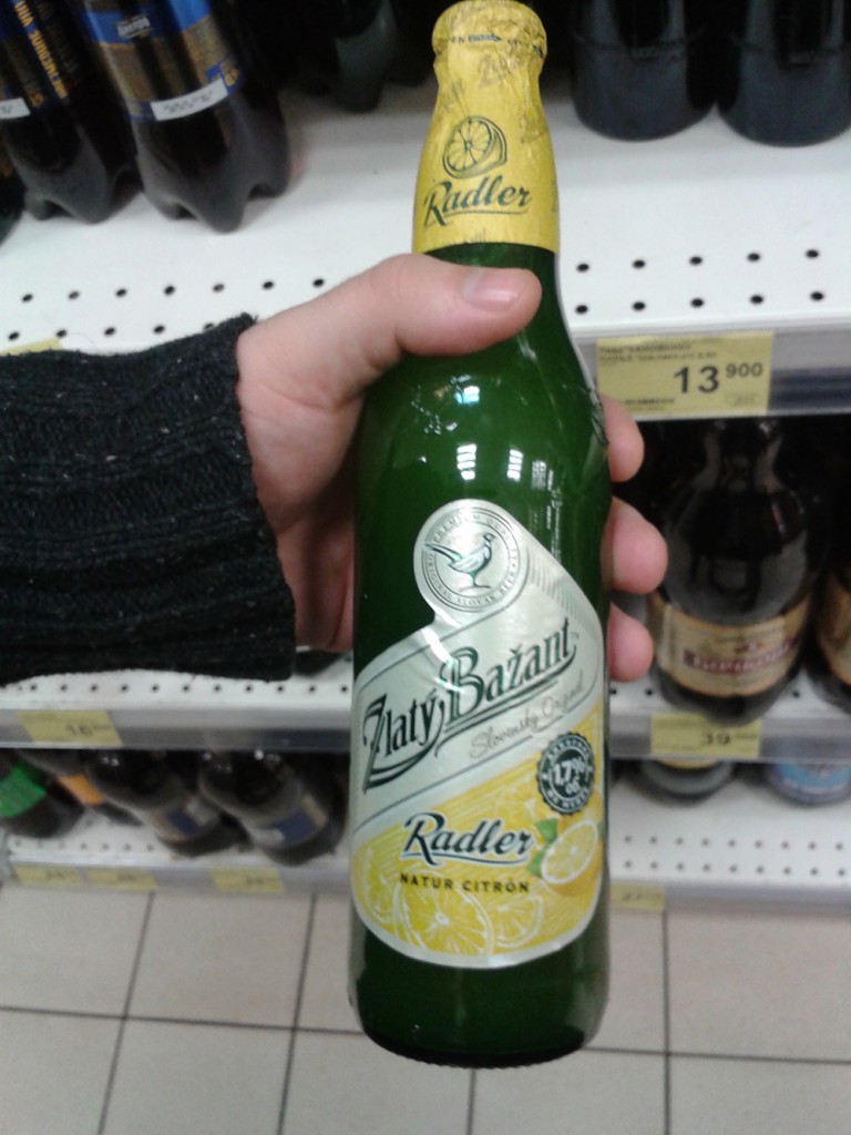
I did a quick phone photo of the beer when I was shopping around for the good subject.
When I got back to my home studio I started sketching out ideas to understand how I can showcase this bottle in the best way possible. What could be a good environment and lighting for the shoot?
I have a big collection of amazing still life images for inspiration and ideas. I did browse it for a while to juggle with a few lighting ideas and settings. Very soon I come up with the vision I wanted for the shoot.
I got in touch with great commercial food and still life photographer Rodion Kovenkin. We talked for a while and decided to collaborate to create the image.
We needed to prepare a few things for the shoot. Rodion was responsible for the camera, studio, lighting and things needed on the set. I had to take care for bringing the beer and art direction to the table.
One small story here. It wasn’t that easy to find the right bottle as I initially thought. I didn’t have access to the manufacturer so I had to buy the beer as everyone else. I visited a few places to find good bottles. I hoped to find really good samples to use for the shoot. Unfortunately, no matter where I looked all bottles had issues. The foil on the neck was always damaged around the cap edges. The labels were somewhat crooked for a few degrees and there were glue spills. There were better bottles with fewer issues, but never no issues at all. Eventually, I decided to take a few bottles with almost no issues in different areas with an intention to composite different elements in post production to get the perfect look.
The Shoot
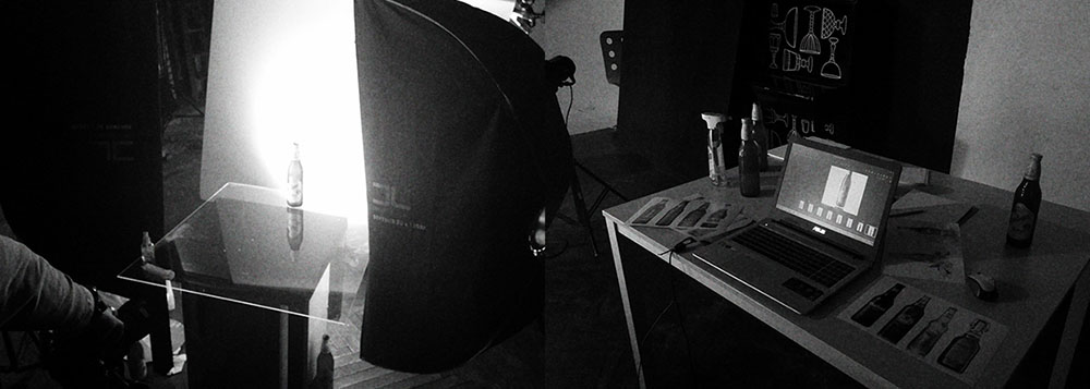
Rodion was the one responsible for setting up the lighting and working with the camera so I can’t tell you much about the setup. I directed the look of the image. It was my responsibility to make sure we have all the elements for post-production at the end of the shoot. What I can tell you is that Rodion used his trusted Canon 5D MK III with Canon TS-E f/2.8 Tilt-Shift 90mm. Profoto D1 Air 500 was used to light the scene.
Before we figured out the lighting we also had to work with a bottle a little. The liquid was too dense. We had to open the bottle and dilute beer with water until we got it right. We also matted the bottle to get the type of reflection I was after.
We shot tethered and I sorted images in Capture One. It’s my favorite RAW images processing software. It still needs improvements in a number of areas, but it’s much better than the rest. I always work in sessions. It’s my preferred way of storing images from shoots.
As soon as we decided on the lighting we started shooting different elements. The images supposed to be composited in Photoshop.
We shot every element separately. Changing lighting a little bit where needed. Here is a list of elements we shot for the final image:
hero bottle shot with water drops
lighting from the right
lighting from the left
bottle cap
label with few water drop variations
hero bottle with ice at the bottom
ice around the bottle
ice for the background
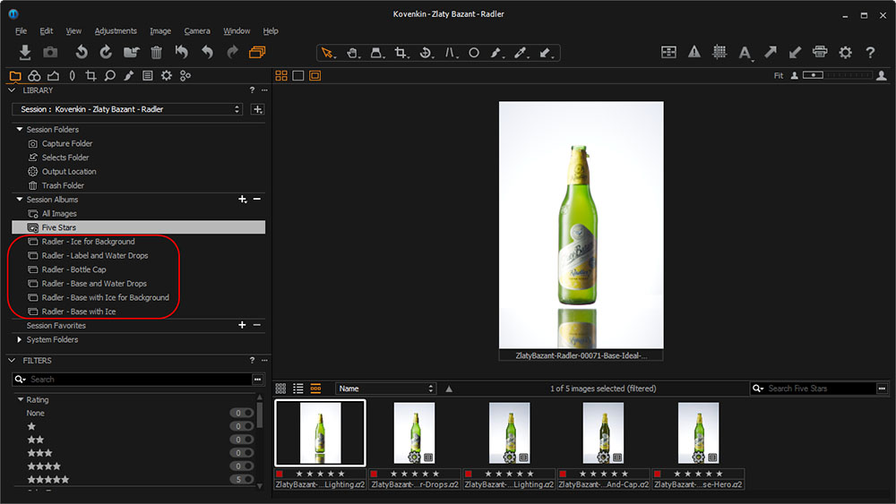
Everything was sorted, color marked and rated during the shoot for simpler navigation.
I have experience in commercial image production where people responsible for the shoot didn’t take their time to have a good system and mark and name files appropriately which lead to a serious confusion during post-production stage. This is something I didn’t want to deal with since figuring what is important and what is not is a huge time waste when you need to start retouching images. You need to know for sure what goes where. Especially for more complexed compositing.
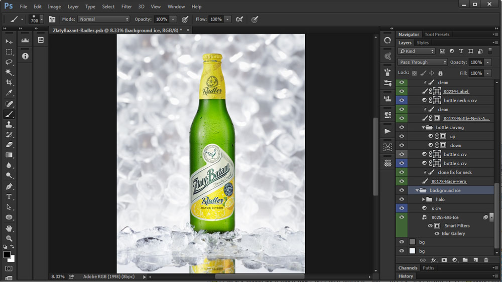
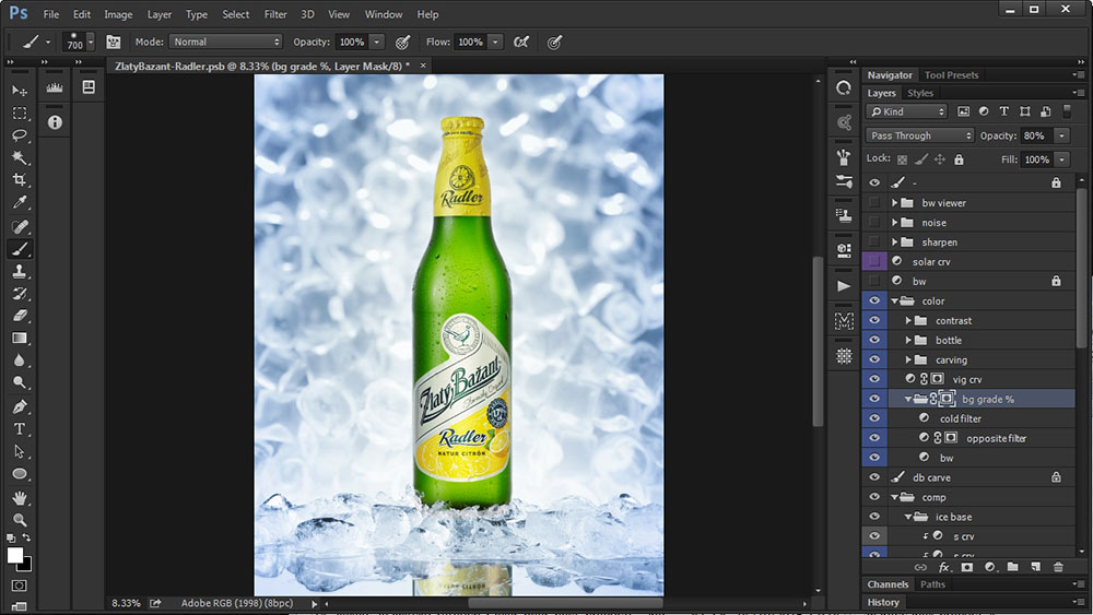
Post-Production
I encourage you to see the video below first.
This is a time lapse of post production process. The video wasn’t supposed to be educational, but explain important stages to create the image like this.
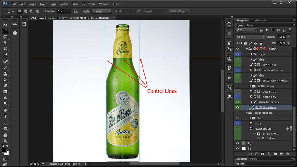
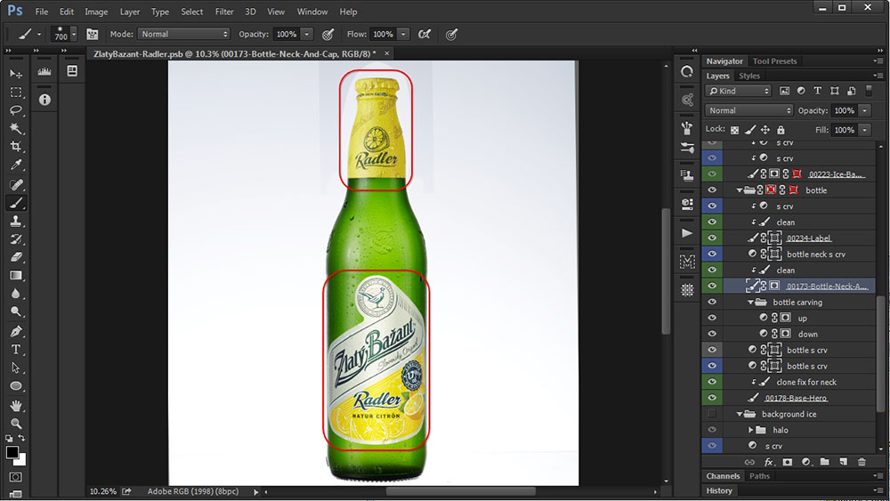
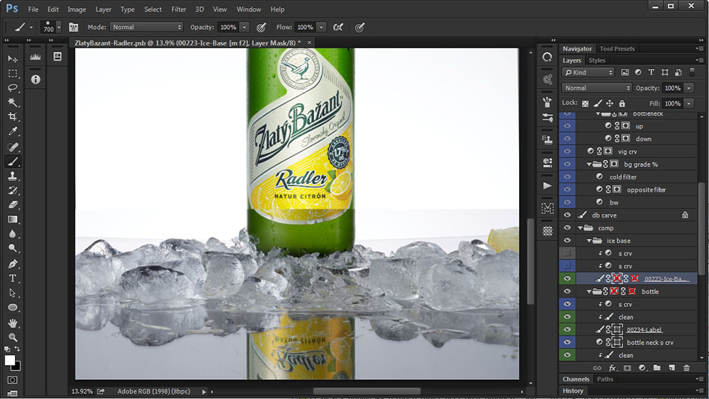
I began with bottle hero shot. I built simple Control Lines to help me notice any possible distortions in the bottle. The were some issues with the perspective which I fixed simply using Transform Tool with Perspective setting.
I added a little more dimension to the bottle. I used Curves to do that.
Some curves were applied to the full bottle and some to certain areas. I masked such areas.
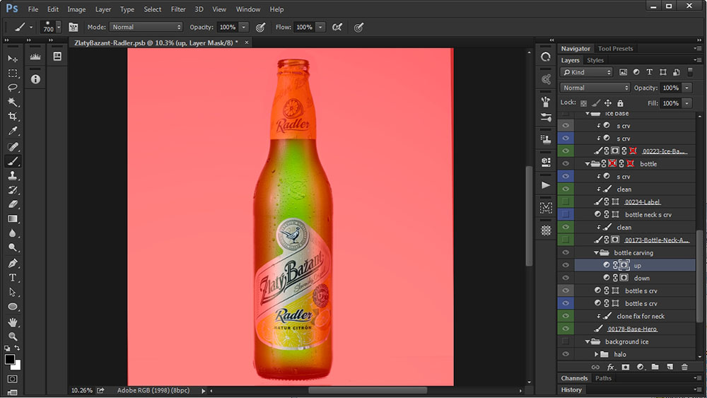
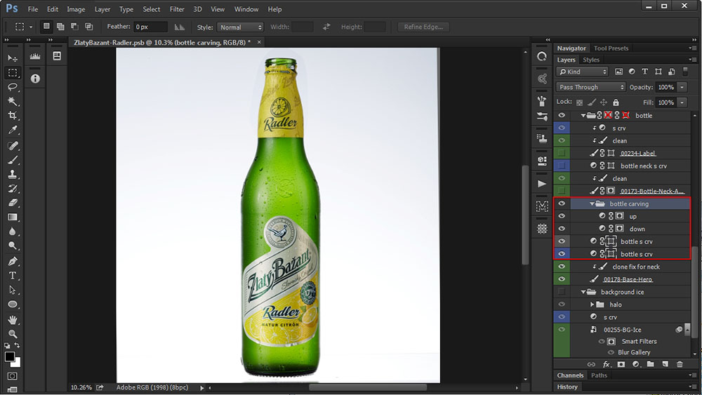
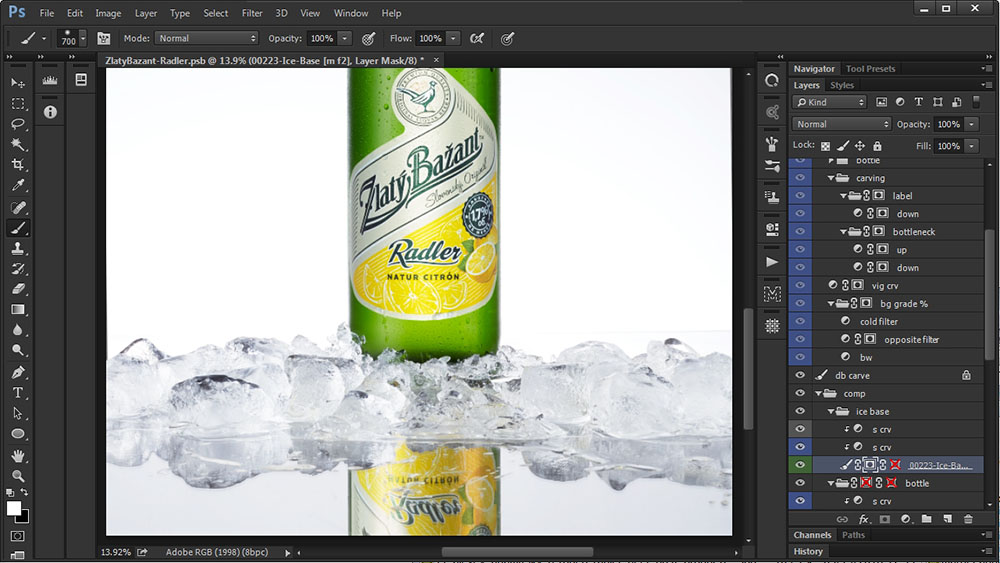
The next step was to fix the cap that we had to remove to change the liquid in the bottle. I replaced the cap and fixed the holes in the foil.
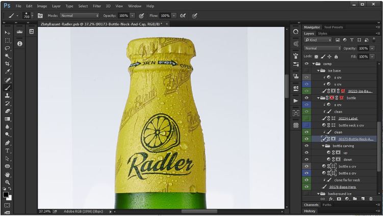
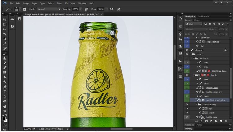
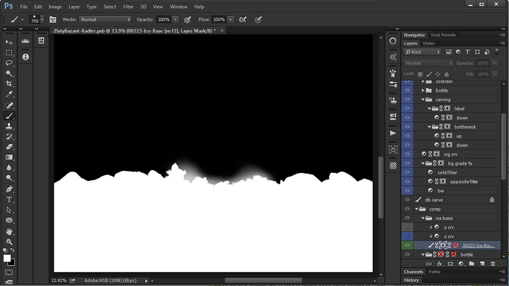
We separately shot the label. I wanted a different lighting on it so we can see it better and with sharper details. I masked out both yellow foil and the label with Path Tool. Path Tool is great for masking out areas with sharp edges. I replaced the label and increased contrast for both elements.
We separately shot the ice for the bottom part of the image. This way it was easy to work on the composition. The were a few choices to pick from.
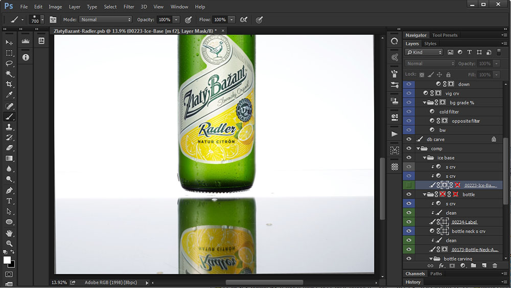
I found the best I liked. Cleaned it up, adjusted the size and masked out. Did a contrast and color correction to match the rest of the image.
The last part of compositing was the background. I knew what I was looking for. We shot a bunch of ice images. There was a particularly good image I duplicated and composited in a new one to fill some holes I didn’t like.
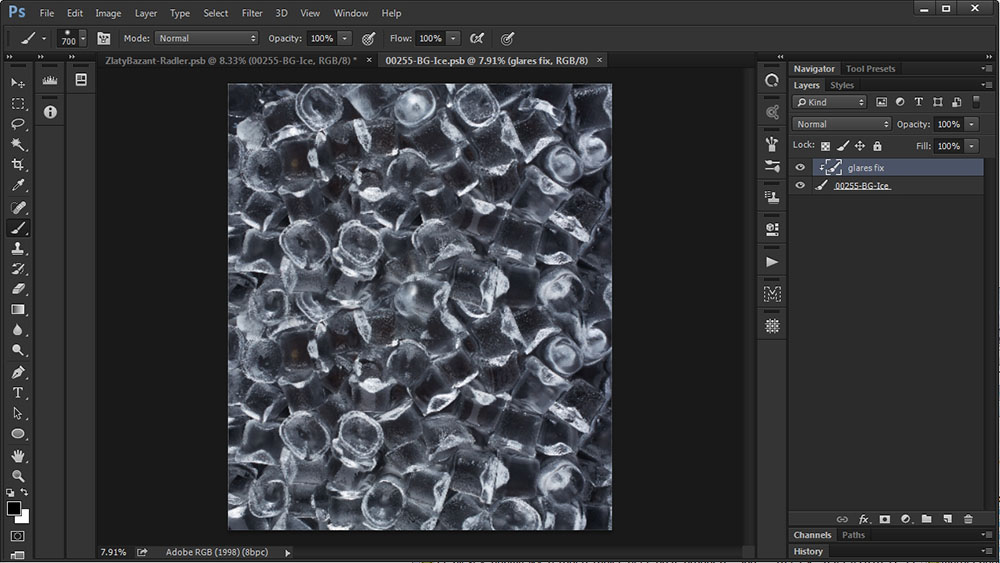
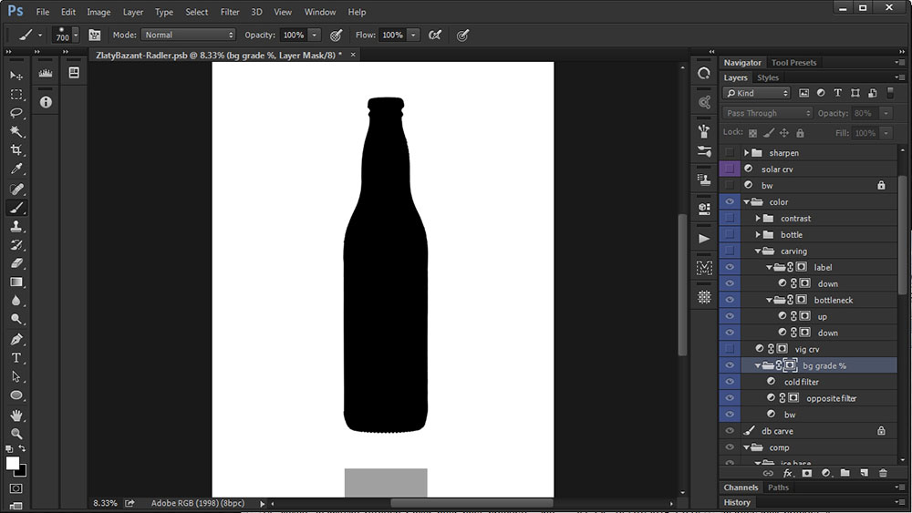
Then I isolated the bottle from the background with Path Tool and placed the ice image. I added Blur Filter and played with settings until I got the effect I was looking for. I wanted to give the depth to the image.
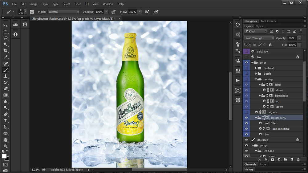
The compositing part was over. I needed to work with colors to tie it all up together.
I thought about the composition and color at the very beginning, when I was developing my concept. This is why I chose ice theme. The bottle has warm colors. Based on that I decided to go with a simple complementary color scheme so I needed the background colors to be cold. It brings colors harmony to the image and makes warm colors – the bottle – stand out more.
Since I already hand all elements masked out it was easy to to color grade the image according to my plan.
I isolated the bottle and it’s reflection and graded the ice.
The rest are the minor changes to give more realism to the composition. I added a vignette to the frame. Bottle needed a blue color spill and light spill around to make it sit better in the composition.
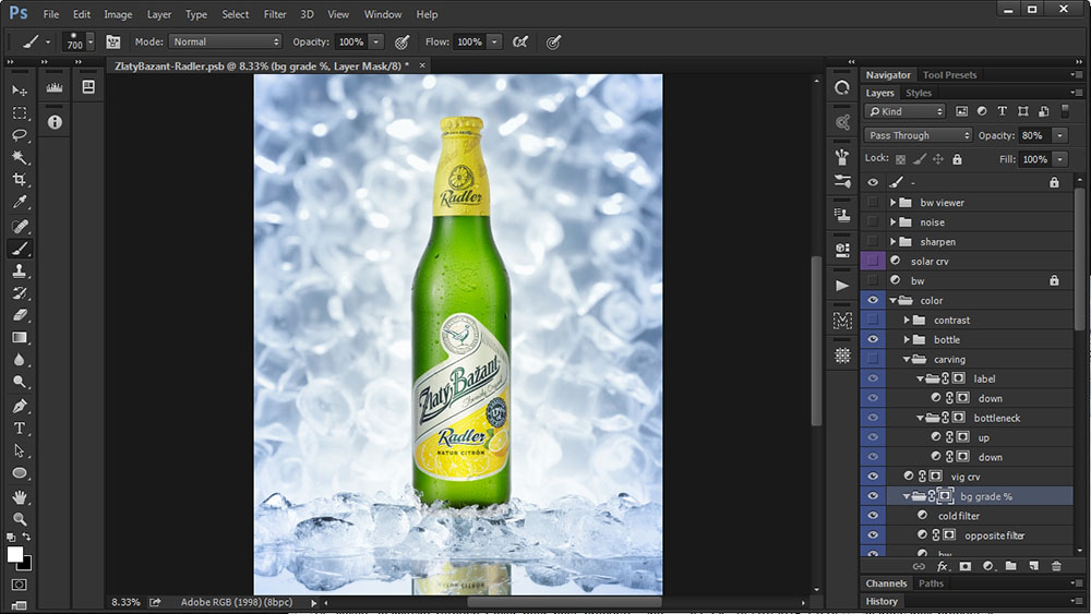
I also did the final contrast adjustments to the bottle and image overall. I used local D&B painting and global Luminosity Masks.
The very final steps were to add local sharping on some elements and I added global light noise which I like because it adds analog feel to the image.
I hope it was useful for you to read about my process. Thank you.